Ollee
- Brand Guidelines
- Prototyping
- Visual Design
- Wireframing
- Illustrator
- InDesign
- InVision
- Sketch
Supporting children’s mental health with digital friend Ollee
Backed by BBC’s Children in Need ‘A Million & Me’ initiative, social enterprise Parent Zone created a ‘digital friend’ Ollee, which aims to help children aged 8-13 express their feelings.
I was the sole designer on this project, responsible for creating the core branding for Ollee, which was used by external agencies to design and build out the final product.
Children aged 8-13 often lack the tools and language to communicate complex emotions
Due to high cases of anxiety, depression and trauma amongst children, the Ollee project was formulated as an approachable digital tool to help children recognise unsettling emotions and communicate them to adults around them.
Key deliverables
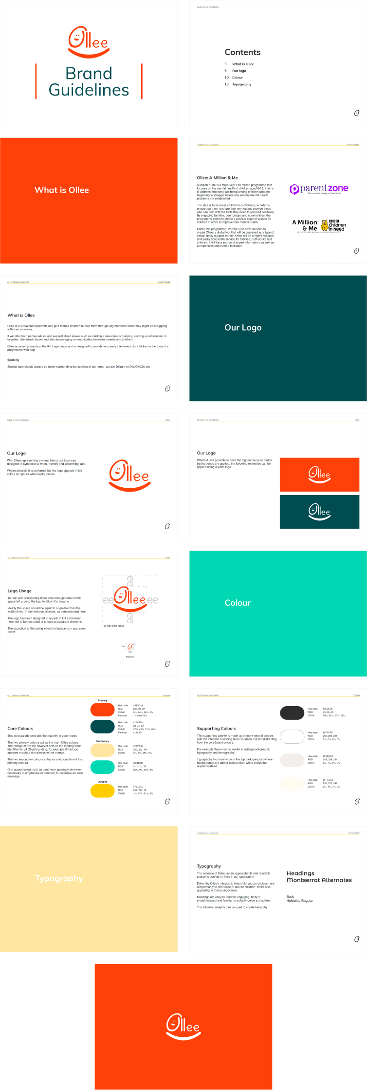
We produced the following, all of which was displayed in a brand guiedlines document for Ollee:
- Logo
- Colour scheme
- Typography
Demonstrating the concept through a low fidelity prototype
We established early product direction through low fidelity wireframes and key user flows to demonstrate how children could interact with Ollee by expressing different levels of their emotions, which they could receive a response on. These tasks were handed off to design agencies early in the process to illustrate the concept of Ollee, to allow them to build an effective pitch response.
Striking the balance between calm, clear and fun
 When reviewing the branding for existing mental health services for young children, the main theme which stood out was gentle messaging through imagery and branding. This was achieved through soft lines and the use of multiple colours. There were no restricted or professional feeling colour schemes.
Considering relatable logo directions
![]()
![]() As Ollee was something to confide in, we needed an approachable and positive feeling logo that children would feel at ease with. We decided early on that the full name ‘Ollee’ should be present in the logo for relatability to the character that would be the face of the service, so explored options with this in mind.
As Ollee was something to confide in, we needed an approachable and positive feeling logo that children would feel at ease with. We decided early on that the full name ‘Ollee’ should be present in the logo for relatability to the character that would be the face of the service, so explored options with this in mind.
A friendly Ollee
![]()
![]() We ultimately selected a final logo that emphasised familiarity and trust through friendly visual cues, such as a smile. This was the direction most favoured by children who were shown our logo developments.
We ultimately selected a final logo that emphasised familiarity and trust through friendly visual cues, such as a smile. This was the direction most favoured by children who were shown our logo developments.
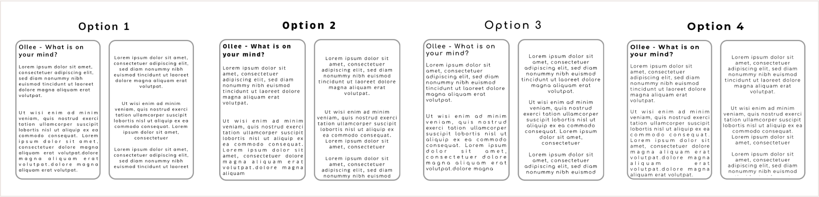
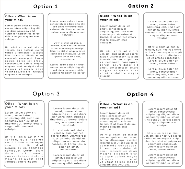
Trying out colour combinations that suited Ollee
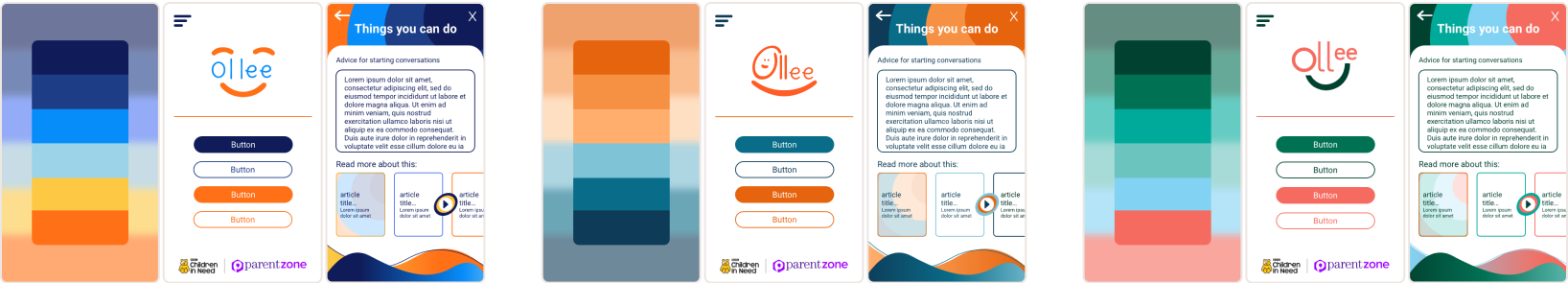
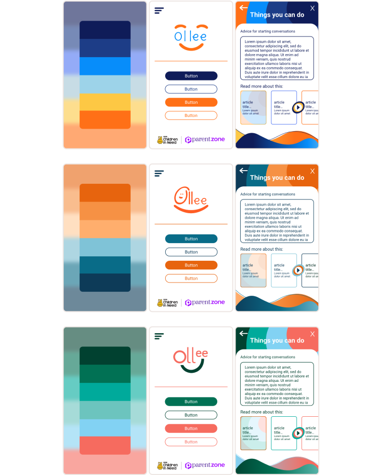 Different colour combinations were placed inside mockups alongside different logo ideas to give a more realistic sense of how Ollee could appear overall. As with the logo, we needed an approachable colour scheme to set the friendly tone of Ollee successfully.
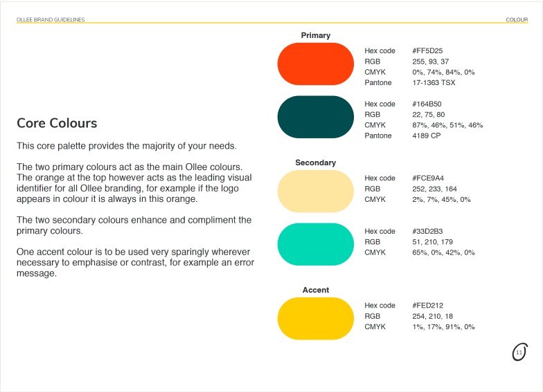
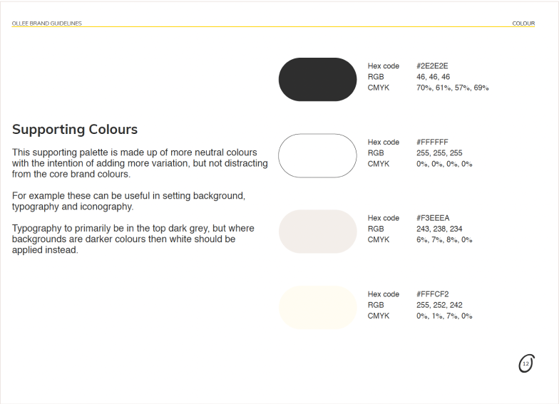
Presenting the final colour scheme and usage guide
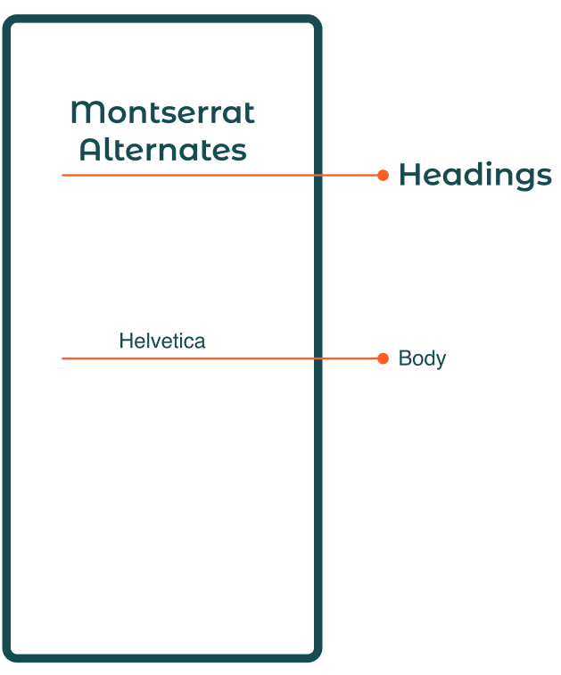
Searching for typography that met different requirements
 Our typography choices needed to do a couple of different things at once:
- Straightforward, for young children to read easily
- Playful, to maintain that friendly feel for them to notice
Typography choices that are both playful and clear
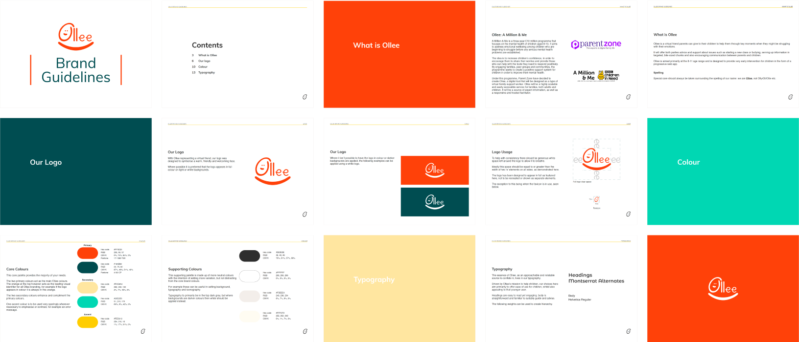
Presenting ‘Ollee’ and our ready to use brand guidelines
With all aspects of the Olle brand, we needed to balance approachability, clarity and emotional sensitivity. The design decisions we made at each stage were grounded in the principles of accessibility and reassurance, whilst remaining functional for digital use.
A deep appreciation for a meaningful project
This project strengthened my ability to translate an abstract brief into a clear product and brand direction, and to produce assets that enable downstream teams to conduct their job effectively. It was an extremely satisfying project to work on due to the underlying objective of supporting children’s mental health, and I was proud of the identity we had started to shape.
My involvement in this branding project reinforced my preference for working in the full product lifecycle, which led me to transition into product design roles.