Navigation redesign
Central hub for automation platform lacked logical navigation
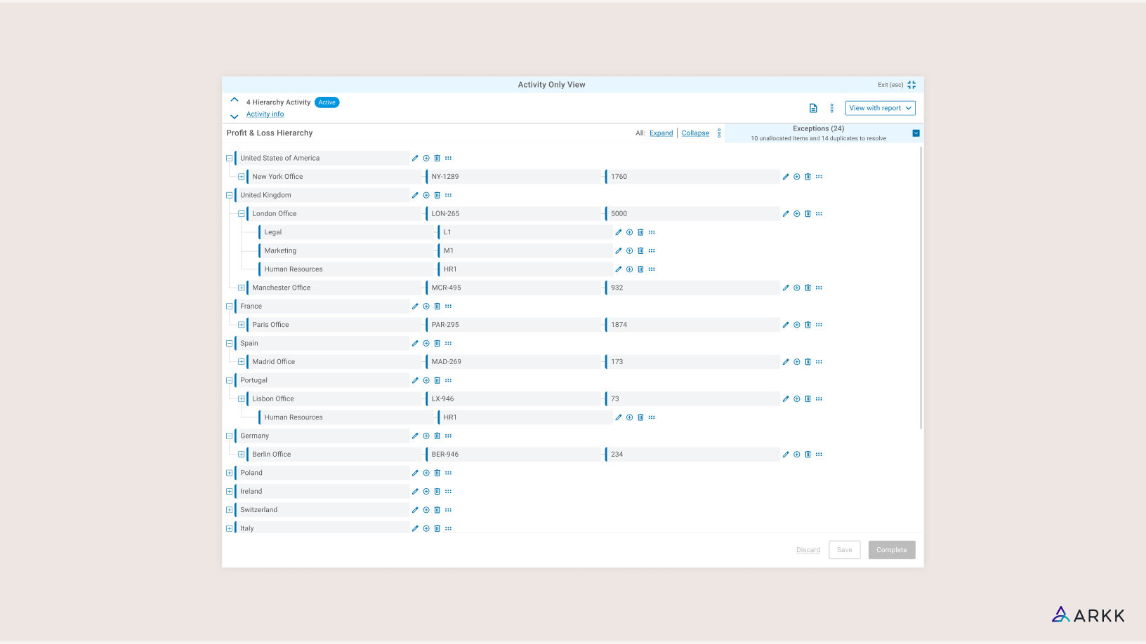
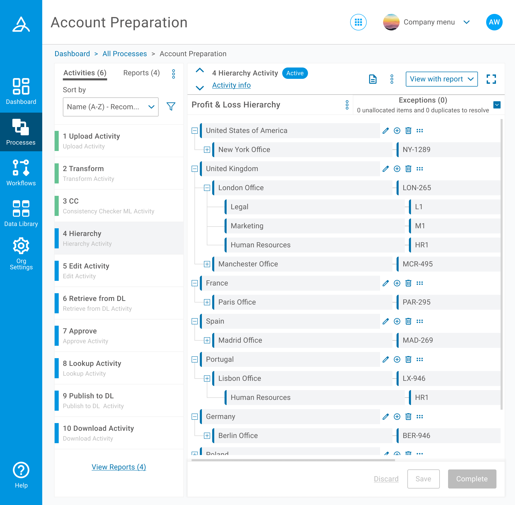
Within ARKK’s tax automation platform, users configure and manage financial processes made up of multiple task-based activities. This process view is one of the most business critical areas of the product, representing the primary workspace for customers to review and execute key tasks.
Despite its importance, the page had evolved into an inefficient, linear interface that limited users’ ability to simultaneously review details and manage tasks.
Working alongside the Head of Design and another Product Designer, I contributed to both the discovery and UX planning, while leading on the visual updates in the details and layout of the UI.
Key achievements:
- High level data accessible at a glance, reducing interaction cost
- Updating filters to be applied, reviewed and updated in one interaction
- A new navigation panel reduced reliance on vertical scrolling
A reliance on workarounds was costing money
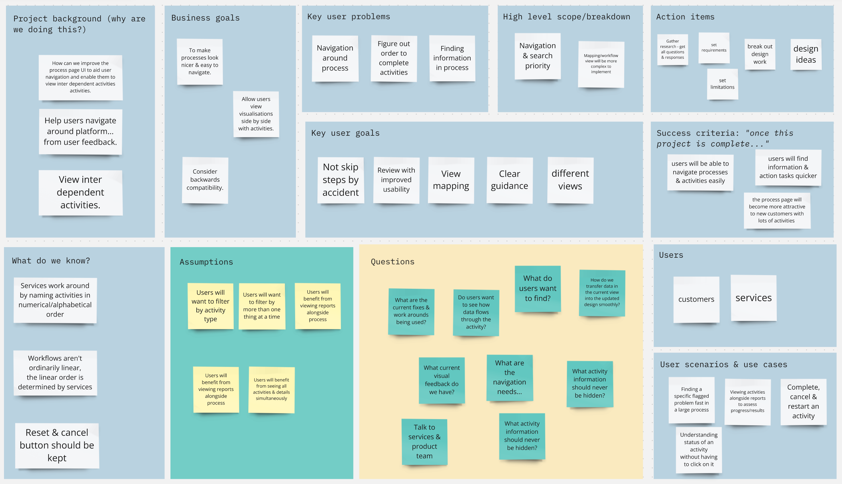
Kick-off sessions were used to understand the extent of the usability issues we wanted to address, including navigation, layout and filtering behaviour. We knew our internal Services team were accustomed to working around issues with manual naming conventions, which ate into their time and therefore the business’s.
Interrupted workflows & endless scrolling
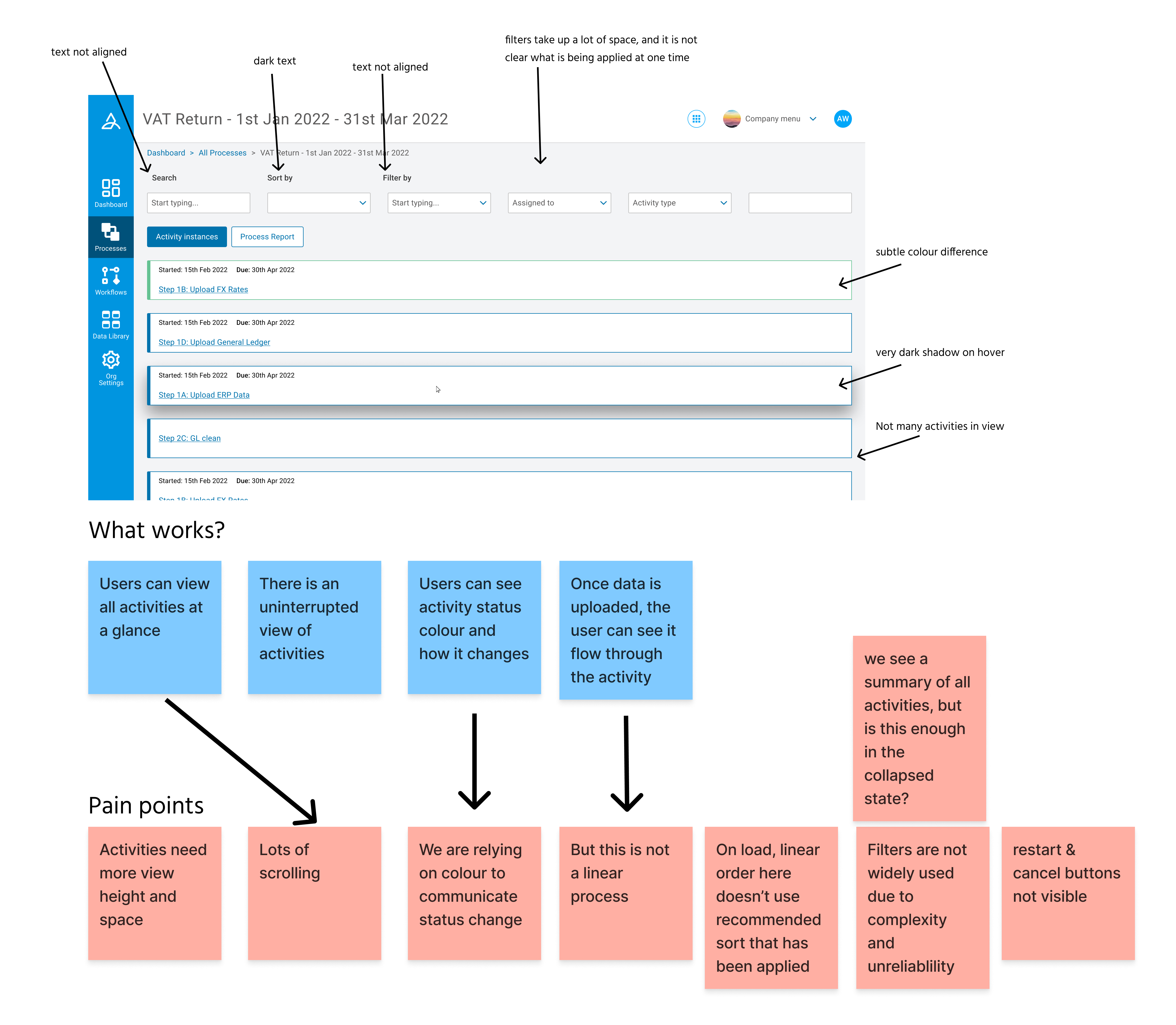
Analysis of the existing process view Identified friction points in:
- Information hierarchy
- Activity discovery
- Expansion behaviour
- Filter application
Platform users confirmed navigation & filtering challenges
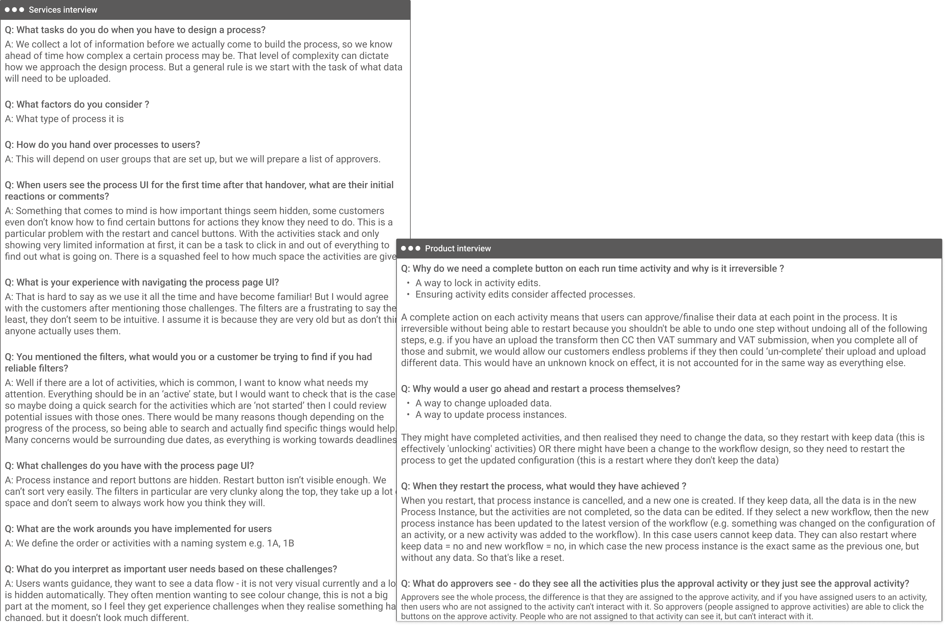
To understand usage patterns we spoke to internal and external daily users of the platform.
These conversations highlighted:
- Frequent confusion around which filters were active
- Activity metadata was often needed for reference rather than action
- Reviewing processes successfully involved scanning several activities simultaneously
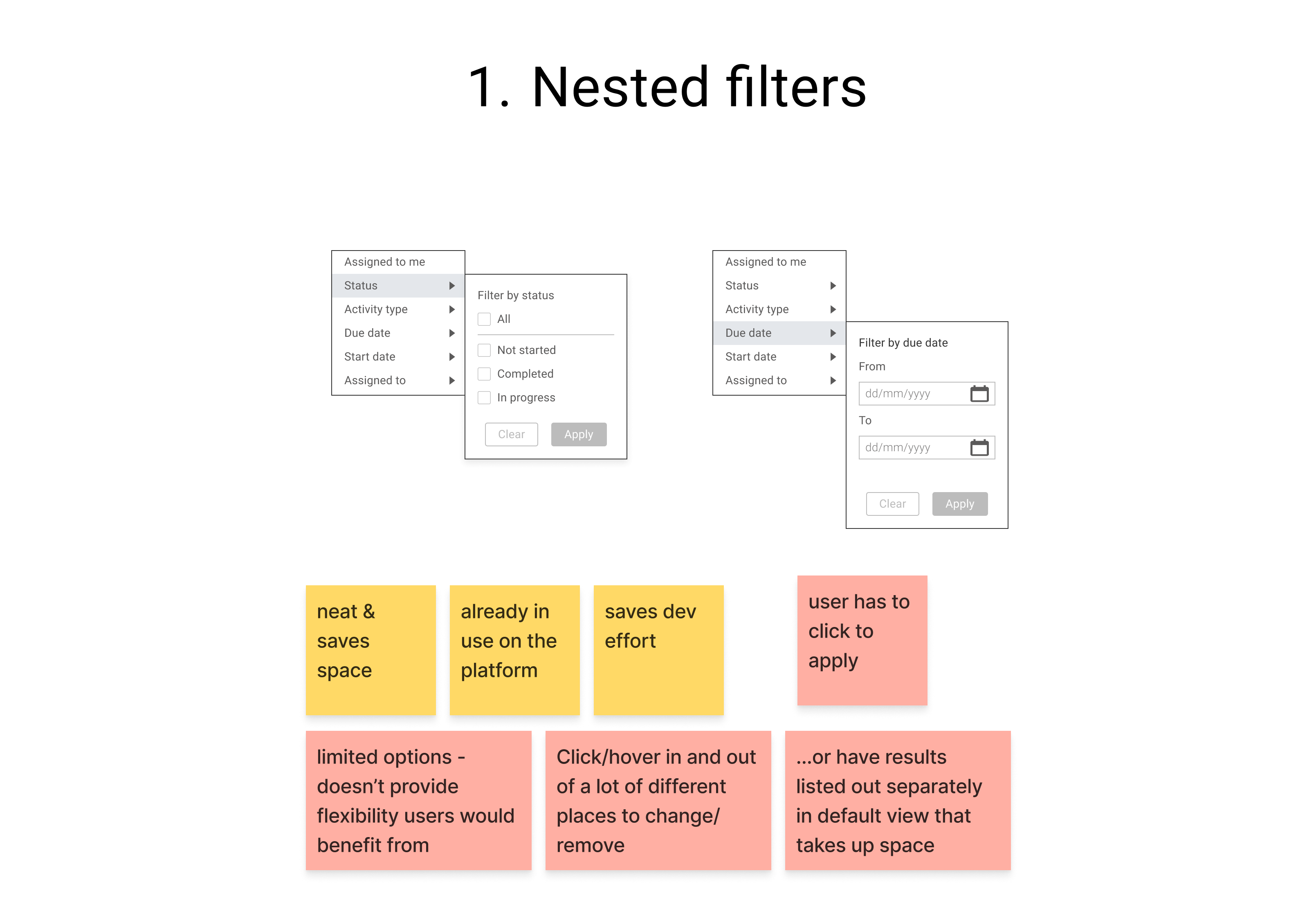
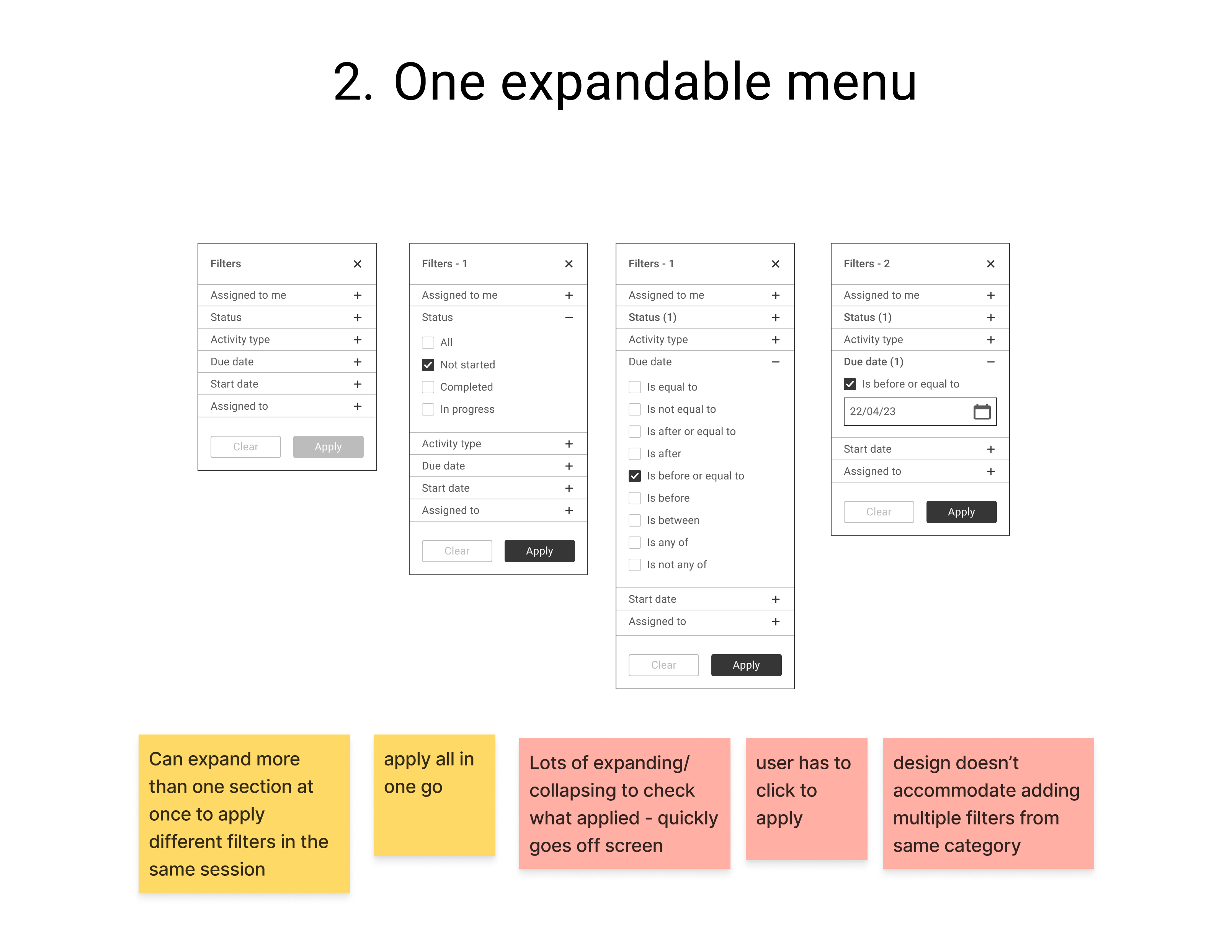
Setting out to improve filtering behaviour
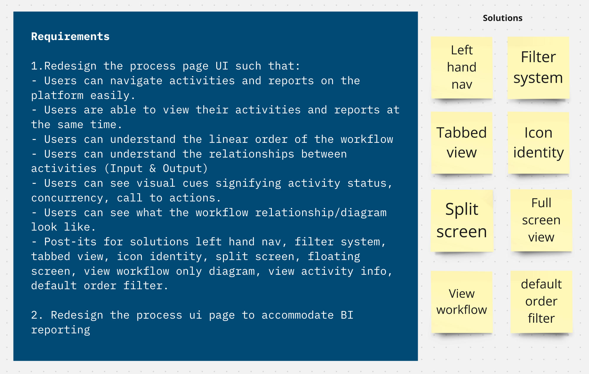
I led the investigation into improving activity filtering within complex process views.
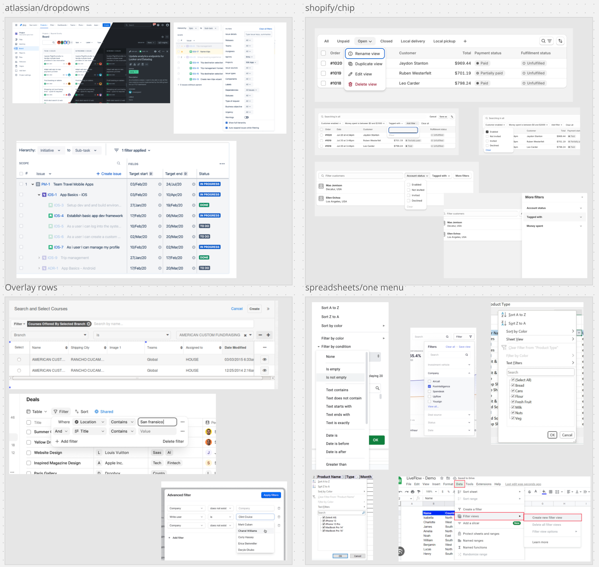
Research across existing approaches to filtering revealed that:
- Filter chips were not scannable within limited workspaces
- Any applied filters needed to be easily reviewable after application
- Advanced filtering required order and clarity in application and review
Exploring our filter options
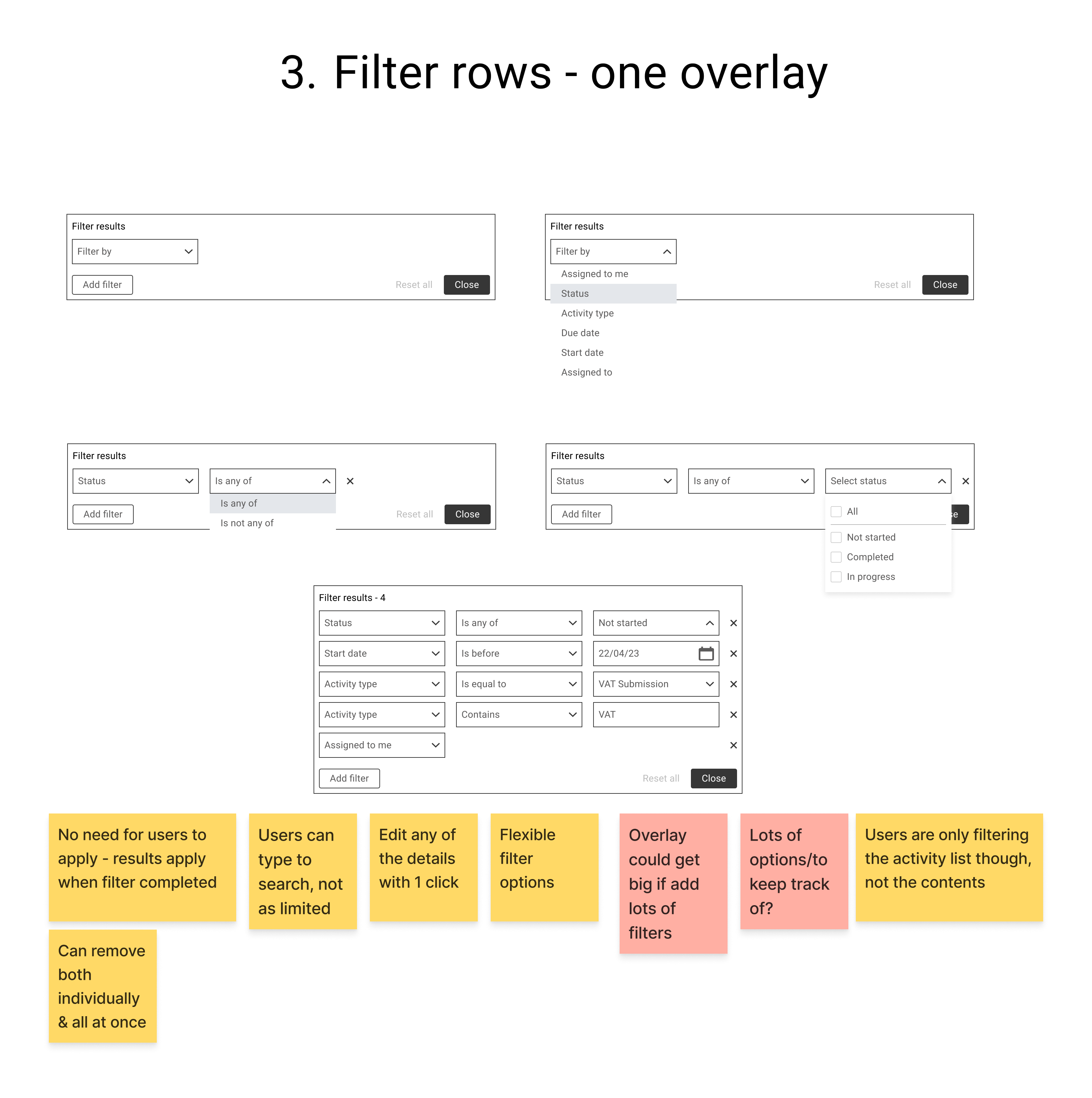
After experimenting with different fundamental approaches to the filtering, we implemented an overlay based system which allowed:
- Multi criteria filters to be added in rows
- Applied filters to be accessed and edited within one interaction
- The main workspace to remain uncluttered
Considering alternative page structures
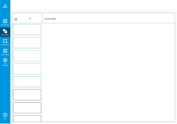
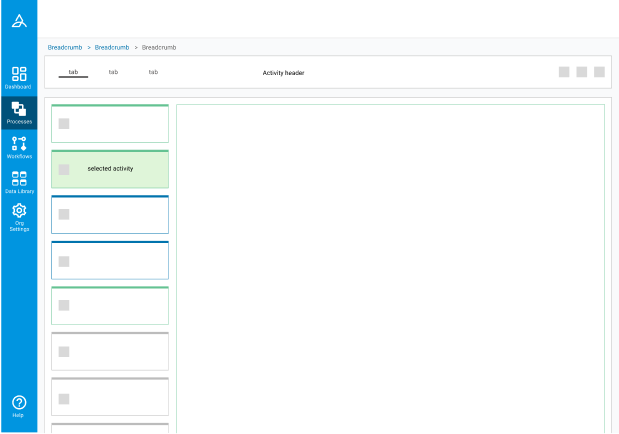
We introduced a navigation panel to bring a much needed overview of all the activities within the process, and provide that high-level metadata without any need to expand anything.
This allowed users to:
- View activity content alongside neighboring tasks
- Retain positional context when navigating
- Reduce the interruption of scrolling when reviewing
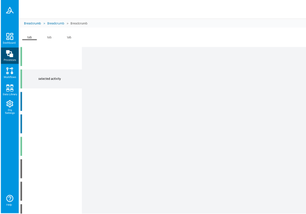
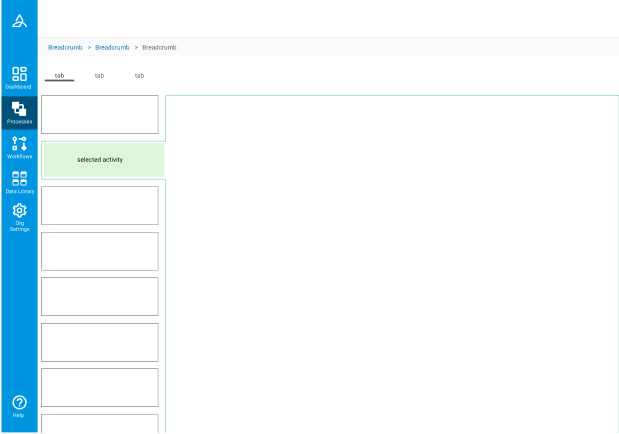
Introducing navigation and a clear viewport
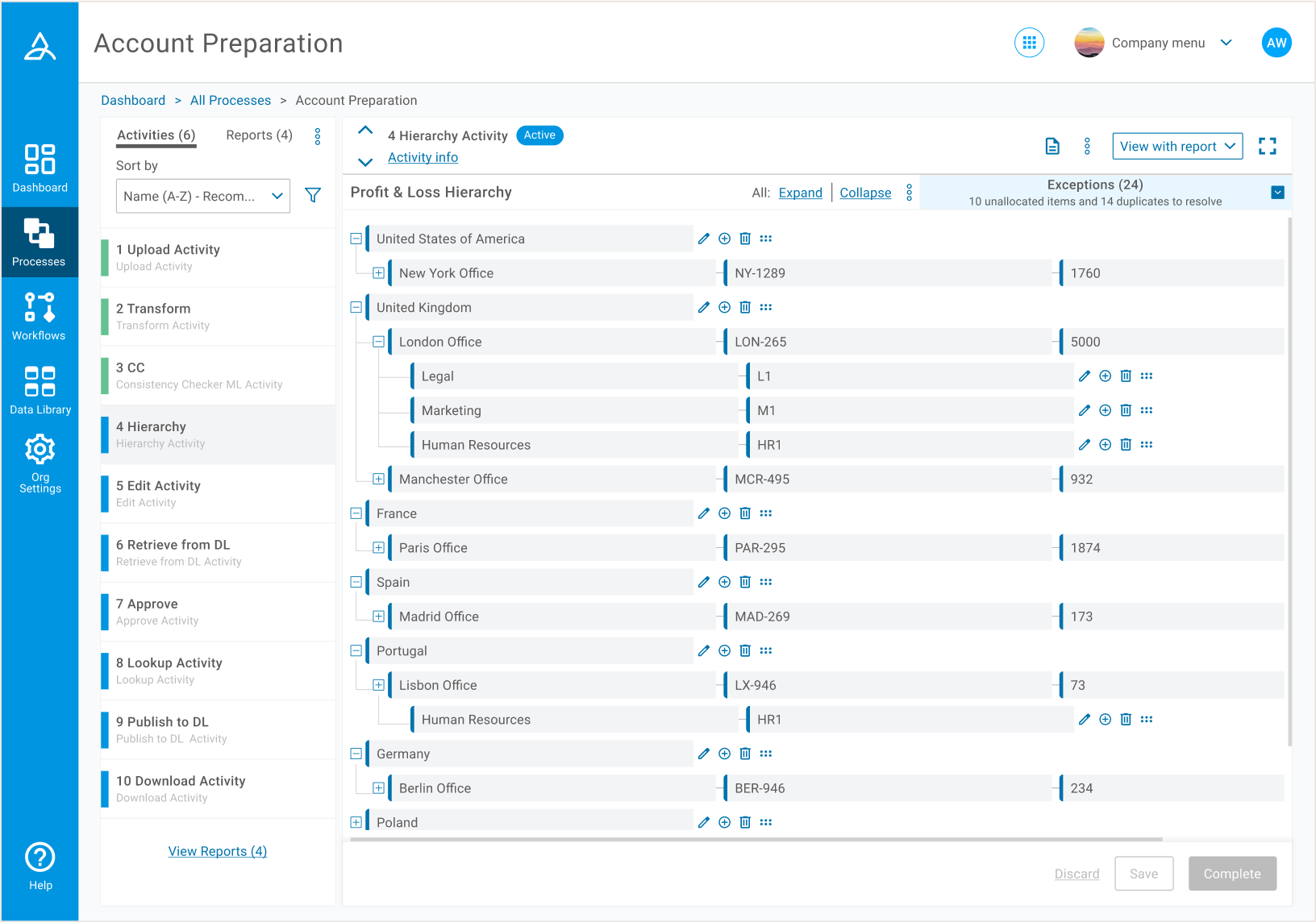 Through the improved layout, users were able to review an overall process structure, alongside the details of individual activities. There was no more need to expand and collapse on a case by case basis.
 Information of lesser importance was hidden on an overlay. This activity info was found to be important, but more of a reference than something that needed to be on constant display.
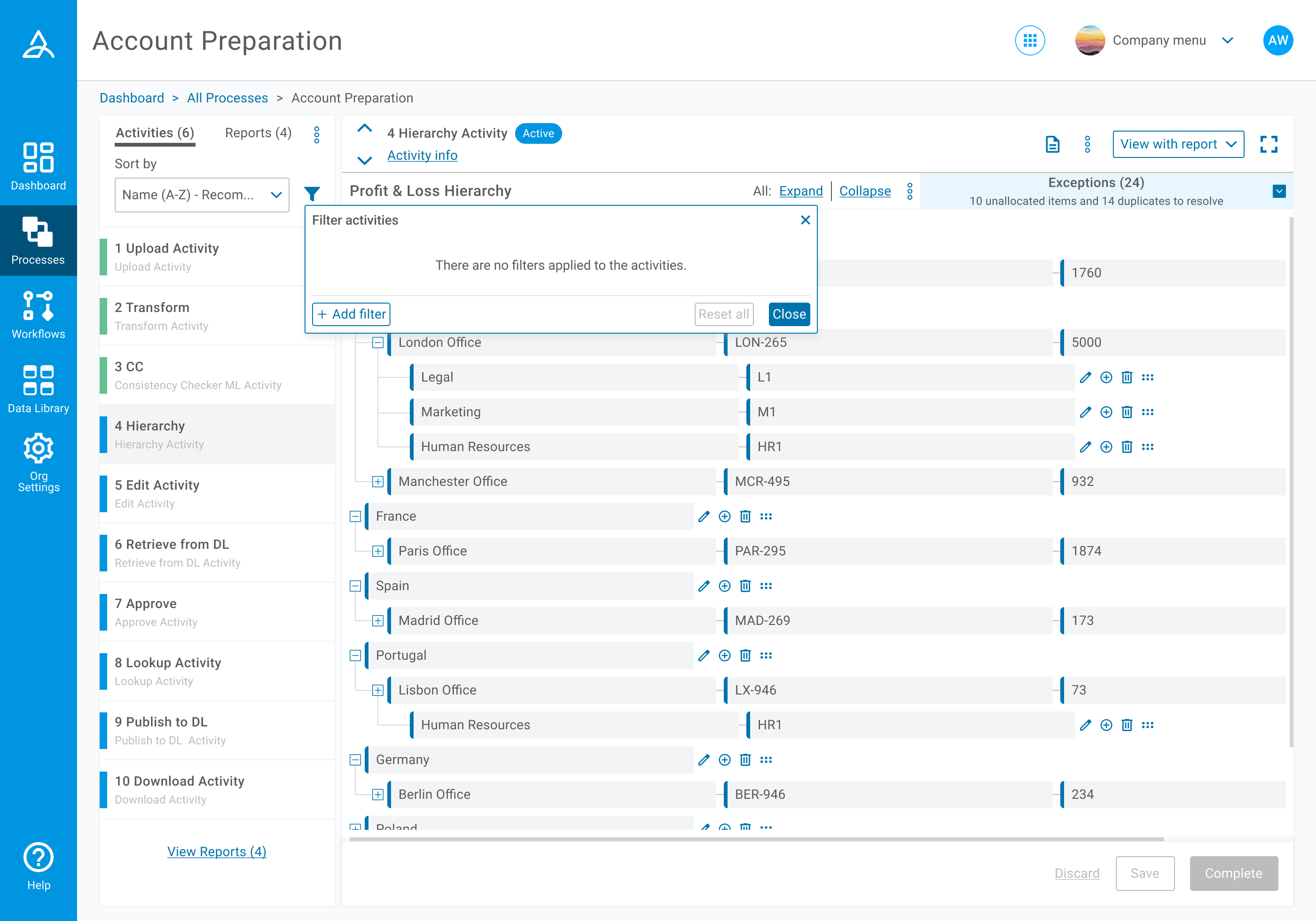

 Users now had a clear indication of any filters that had been applied, and could then view the specific details of each filter easily.
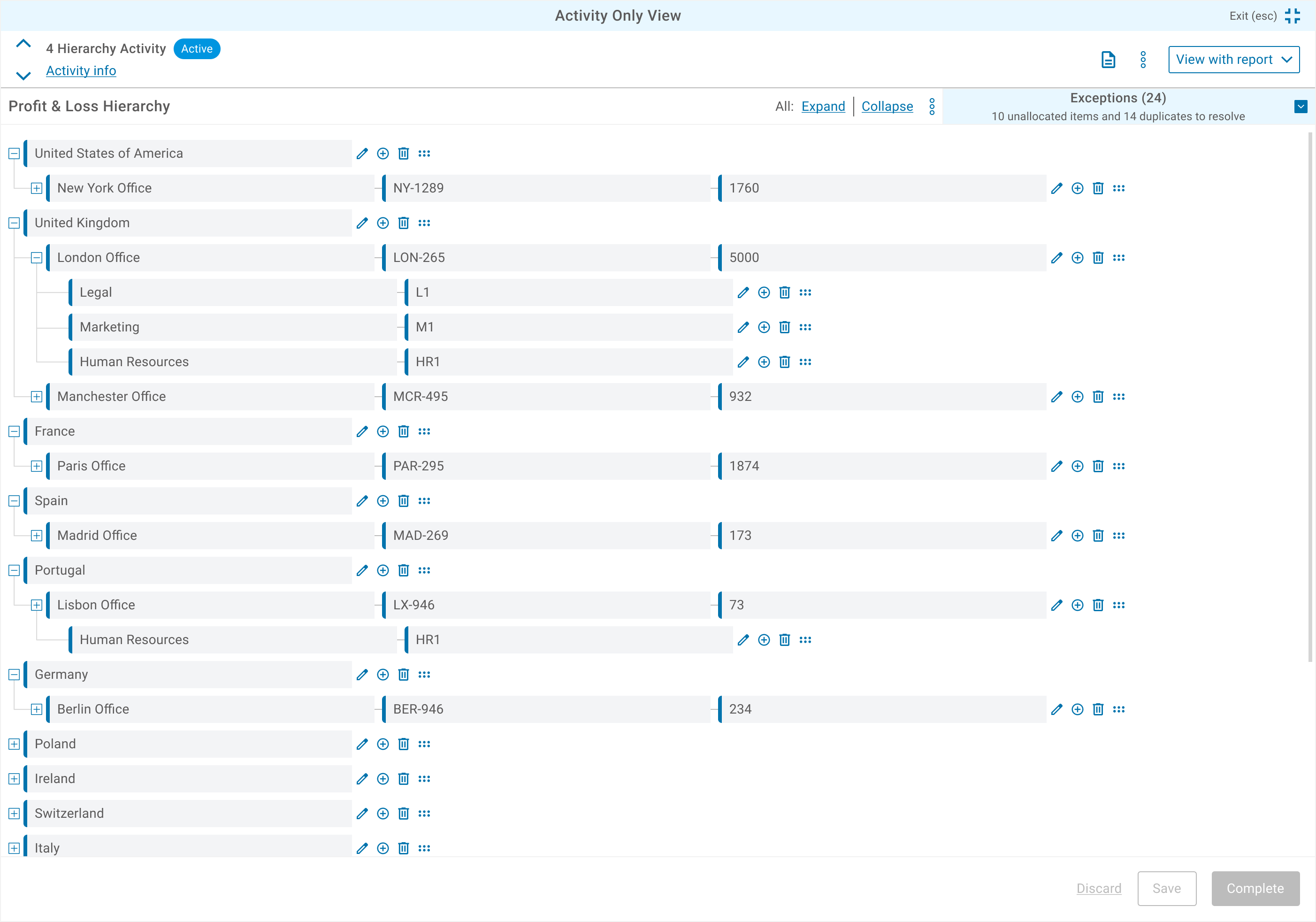 Full screen view.
 Minimum screen layout.
Customers were no longer exhausted by scrolling
Customer feedback following the release of the restructured page indicated a massive improvement in reviewing and managing processes. We experienced a reduction in customer service tickets over basic tasks around activity and process management.
Internally the redesign established:
- A scalable layout for future workflow complexity
- A consistent filtering framework across activity types
- When customers did need help, an ability to help them much faster with the improved layout and design
Learnings and an underestimated timeline
As project scope expanded, I became increasingly involved in research and planning activities to support design decisions across navigation and filtering. This was a great learning opportunity for me to step outside of purely the visual updates we had planned, and I really enjoyed the different approaches each of these tasks demanded.
While the release improved process reviewing, future iterations around complex connections would further help customers complete their tasks, specifically around visually clarifying which activities needed to be completed before the others could commence. This is not a linear process, and currently not visible in our designs above.