Product Portal

A fragmented sign-in experience for customers & poor product visibility for ARKK
ARKK’s product offering consisted of four platforms, each with its own sign in interface. If customers worked across multiple products, they did this via product specific URLs with no ability to jump across within a shared platform.
Connected products, detached logins, frustrated users
We needed to provide a shared sign in experience that would reduce the friction of a back and forth workflow, whilst also taking the commercial opportunity to increase visibility of ARKK’s wider product offering without interrupting primary user tasks.
I joined the project as a UI Designer, but transitioned into leading UX delivery following internal team changes. This included defining cross-product navigation patterns, portal information architecture, and interaction behaviour for a new shared login and access experience.
Key achievements:
- Sign in entry points reduced from four to one
- Users with multiple licences could move between platforms without re-authenticating, removing repeated login friction
- Product discoverability increased through portal exposure, supporting internal cross-sell initiatives
- A scalable framework was setup to facilitate future product additions
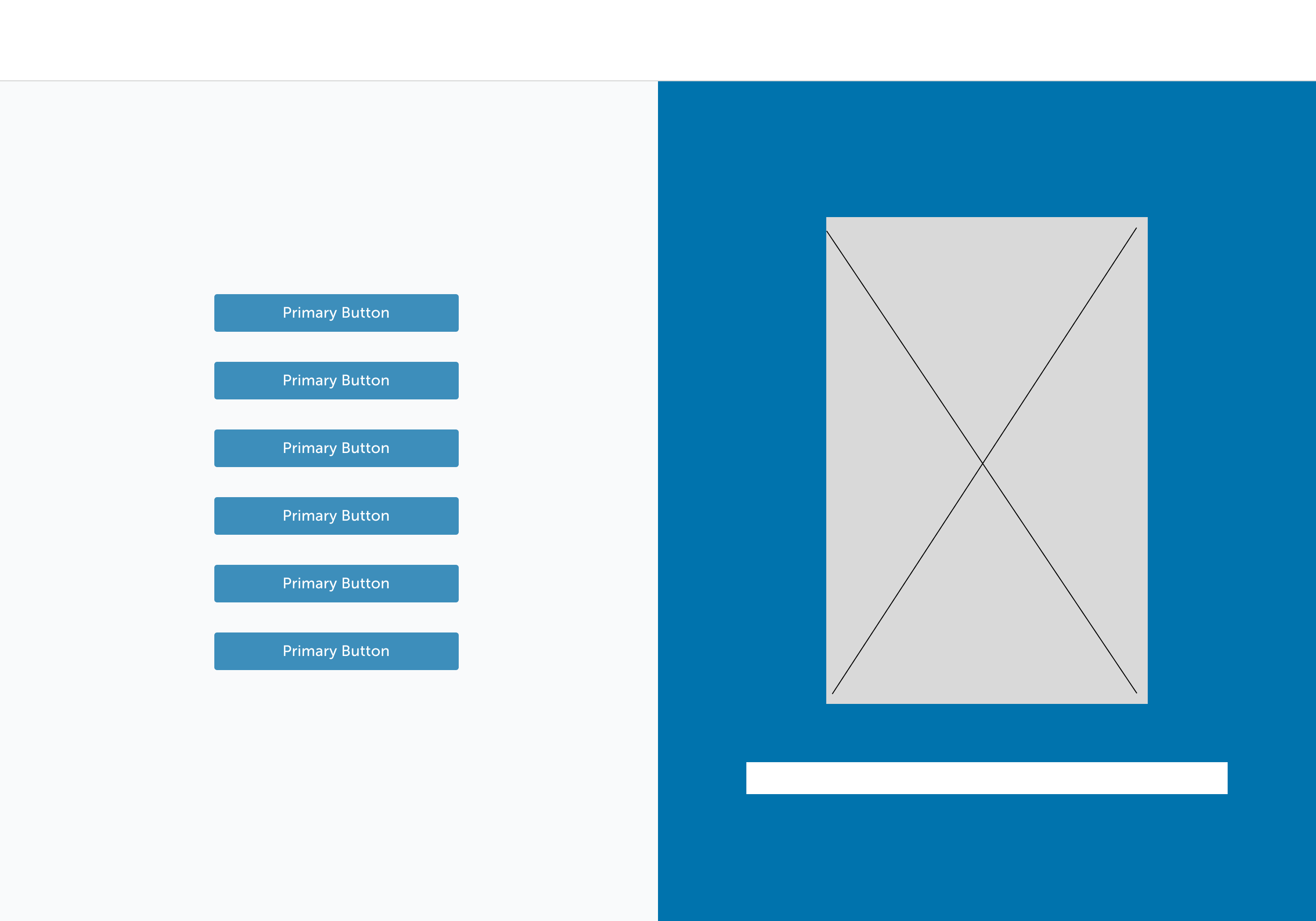
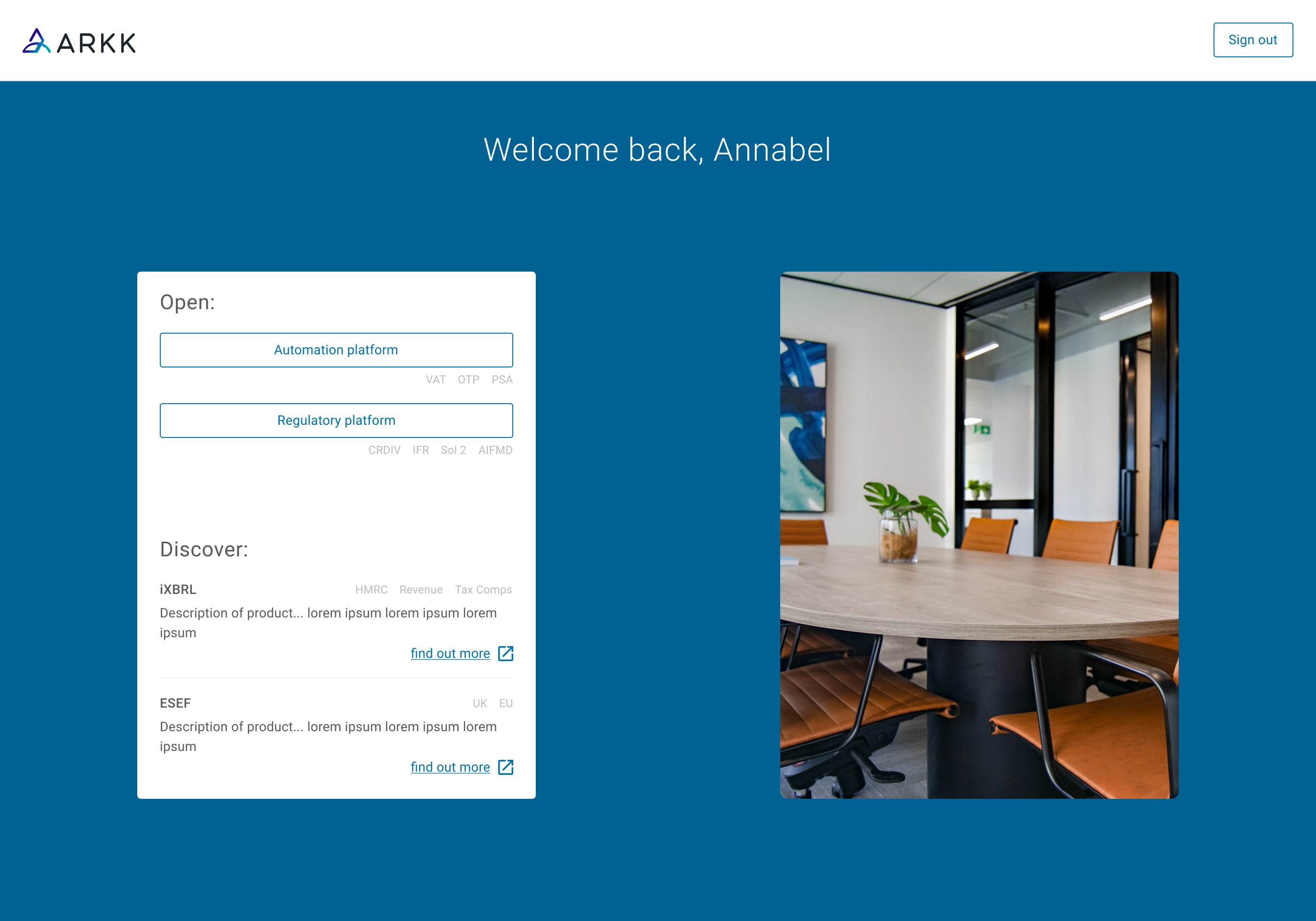
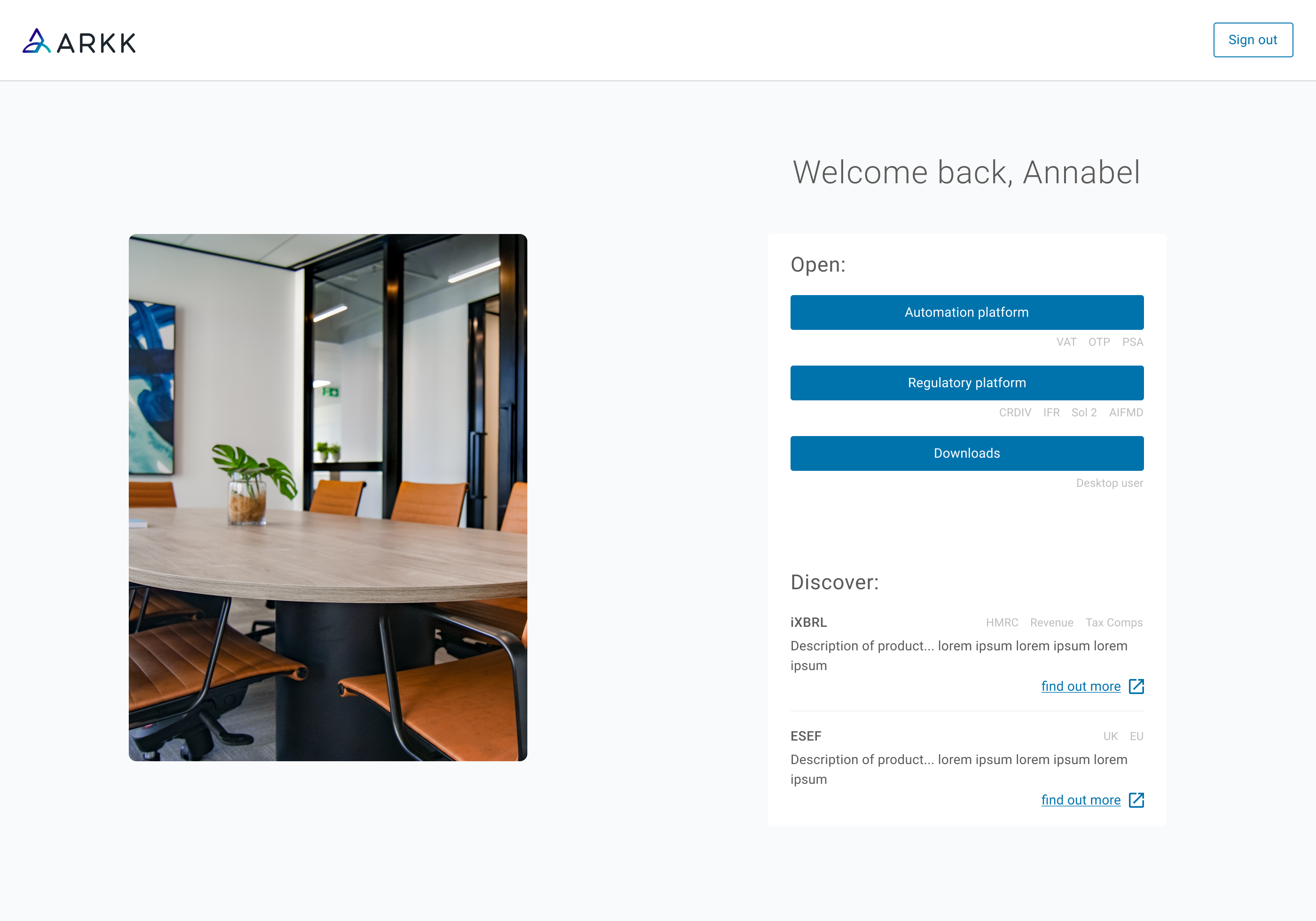
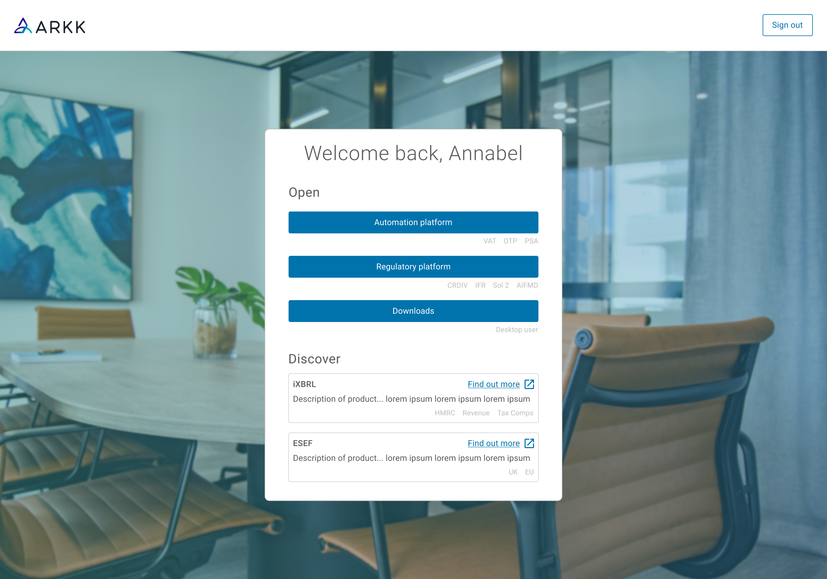
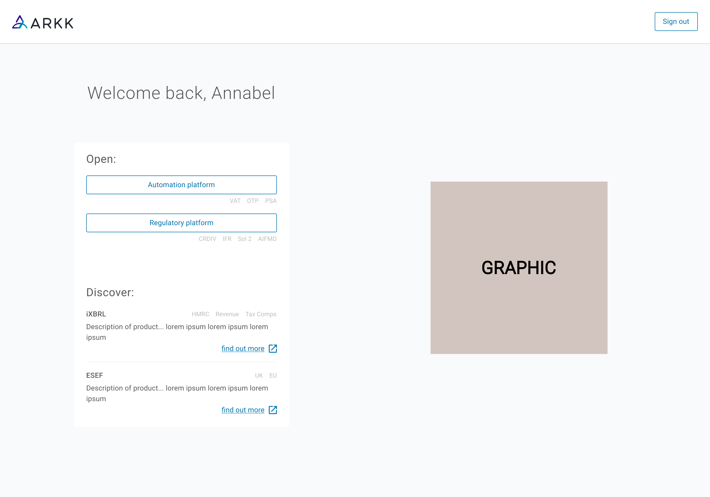
Creating a new step when signing in
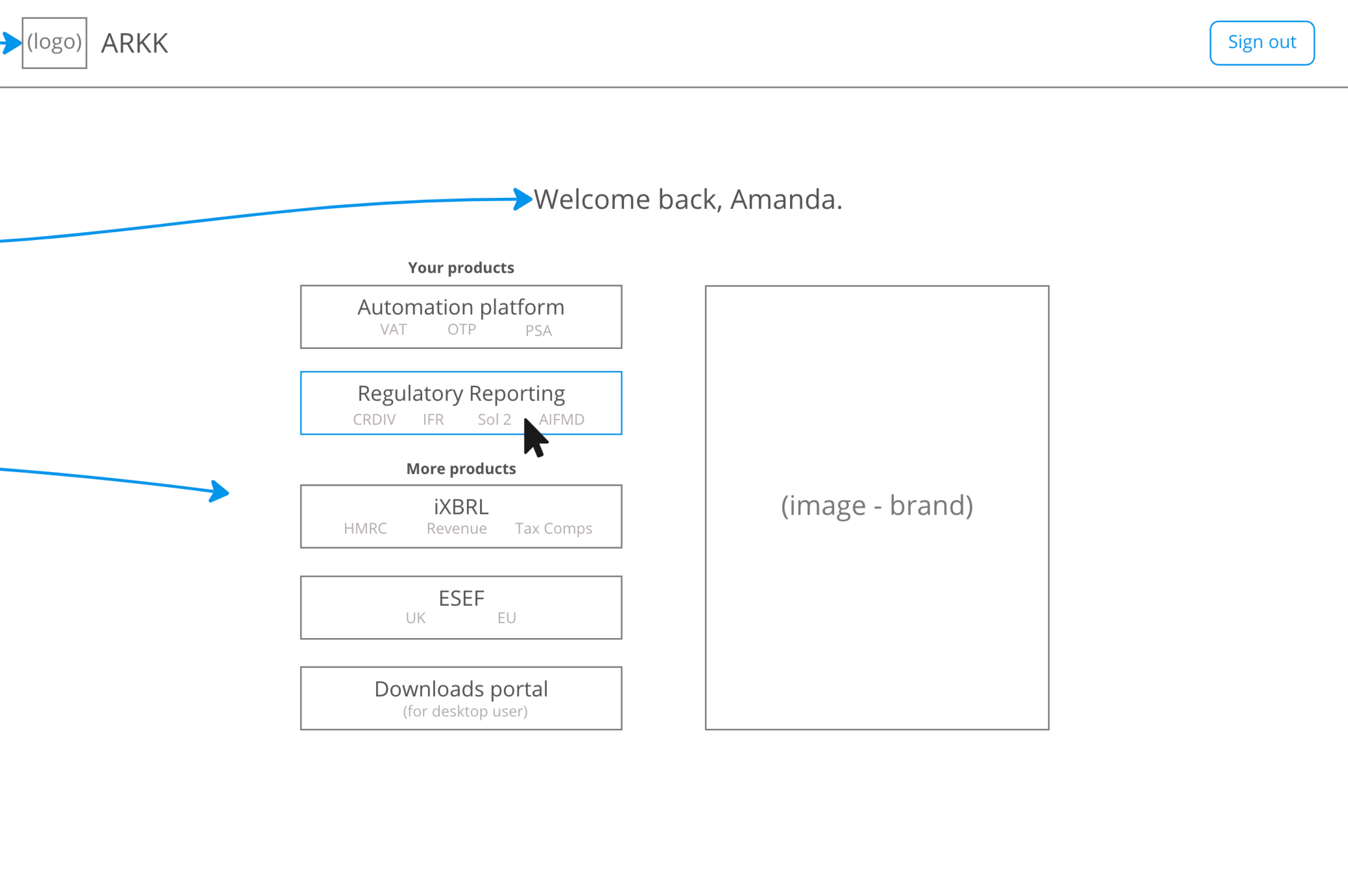 A new single sign in page would act as a central access point. Customers would then be faced with a new page where they would be required to select the product they wished to use. The creation of this page was key to enabling product education without disrupting task completion.
Adding cross product navigation
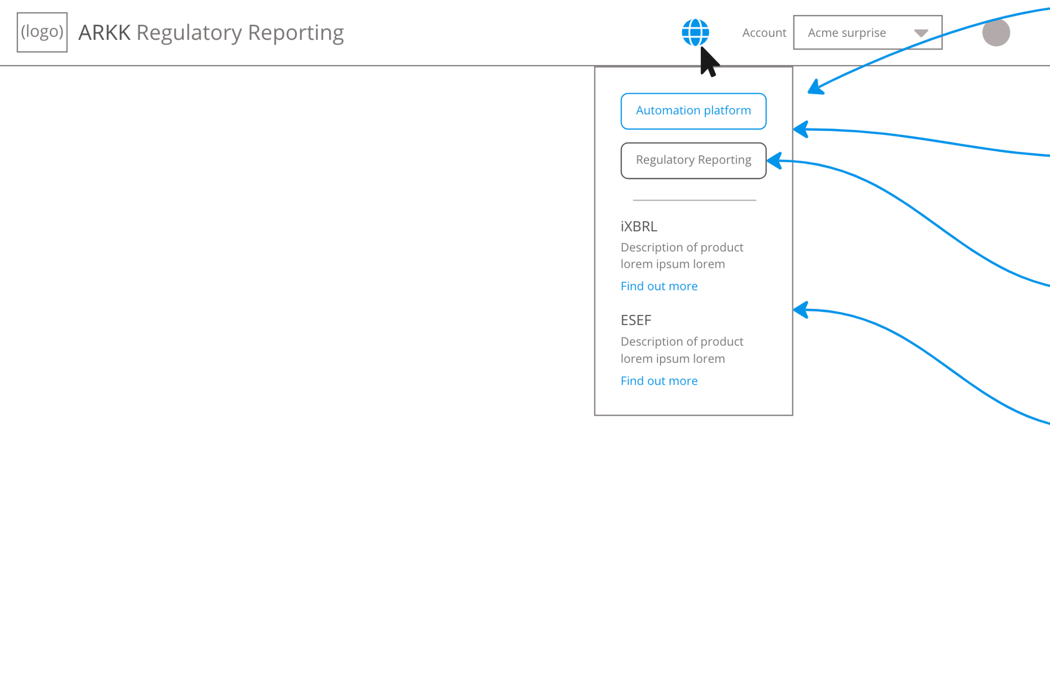 A further addition within each platform was a universal product menu to enable movement between owned tools within a single authenticated session.
Testing different menu & icon options
![]()
![]()
![]() We needed this new menu to be clear yet not interfere with existing components and prioritise immediate access to owned products, whilst surfacing the existence of others.
We needed this new menu to be clear yet not interfere with existing components and prioritise immediate access to owned products, whilst surfacing the existence of others.
Our menu & icon choices
 We adopted a grid based icon, which was consistent with established multi-product platforms, reducing any learning curves for existing customers.
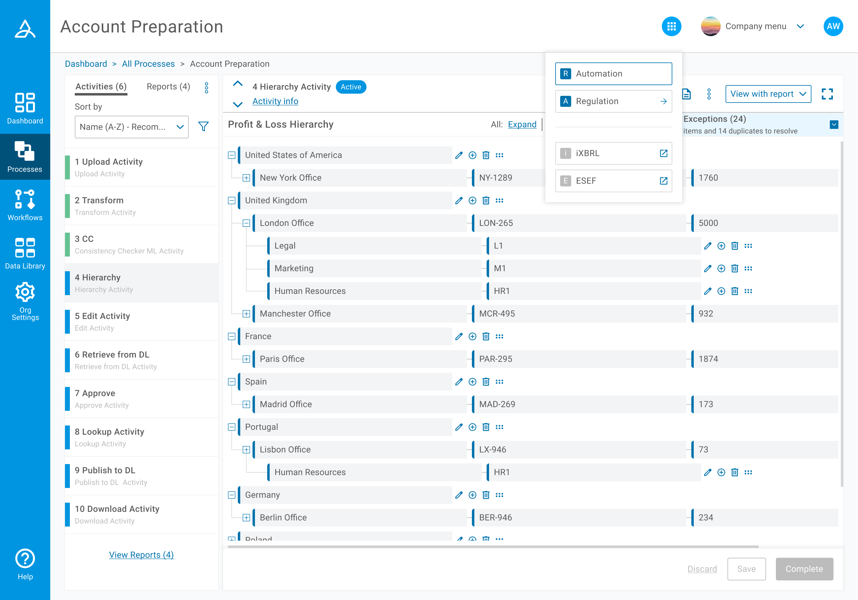 For the open state of the menu we needed to list existing products alongside others.
Plotting the structure of a new page
As this was a new page, we had many opportunities to consider. When in this stage I sought to balance usability with commercial visibility. In order to achieve this I facilitated layout and prioritisation workshops, even at this early stage.
We needed to align on:
- Product exposure requirements
- Navigation hierarchy
- Implementation constraints
Encouraging stakeholder input
Early alignment across Product, Marketing, Engineering and senior leadership reduced iteration during development and enabled the portal to support both usability and commercial objectives. I received a lot of gratitude for including wider teams in a process they do not normally witness, yet appreciated collaborating in.
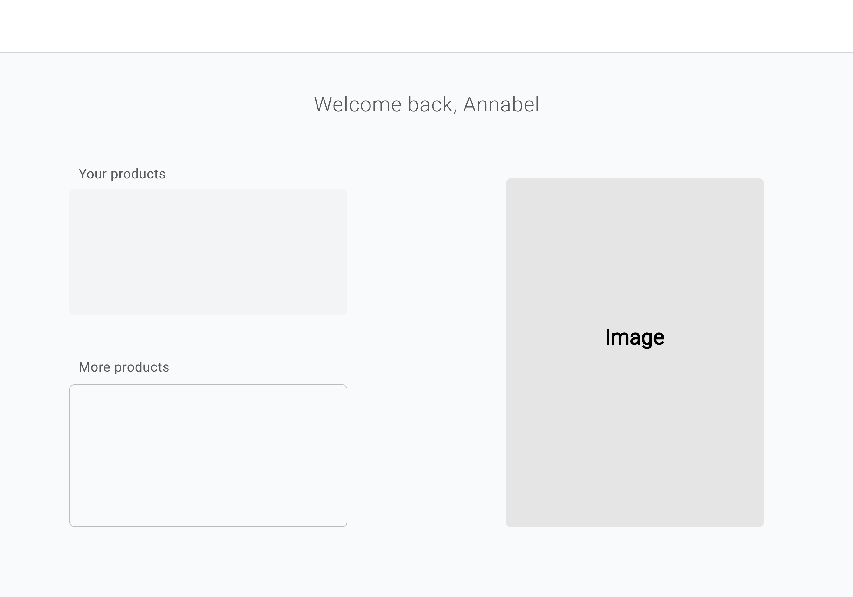
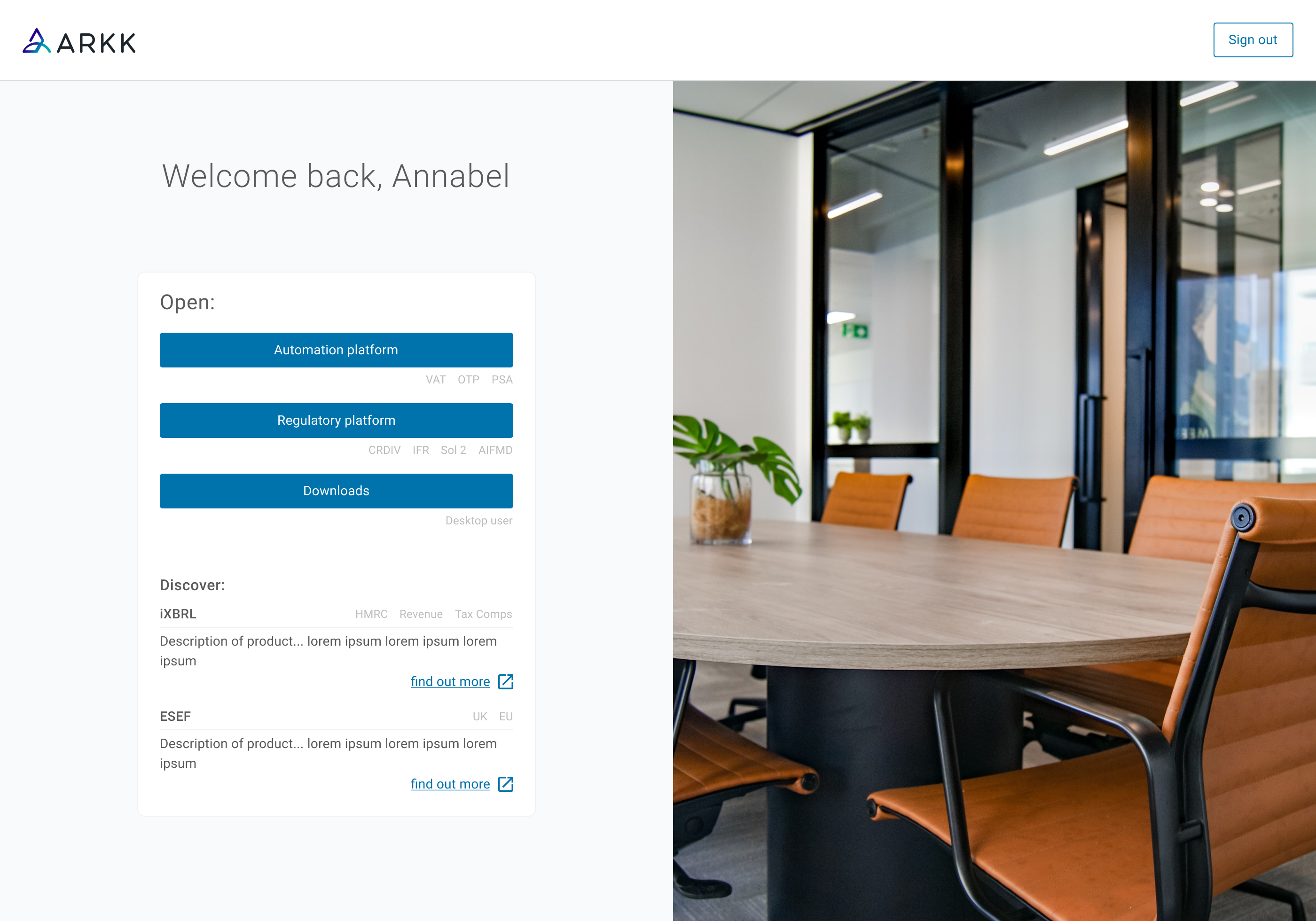
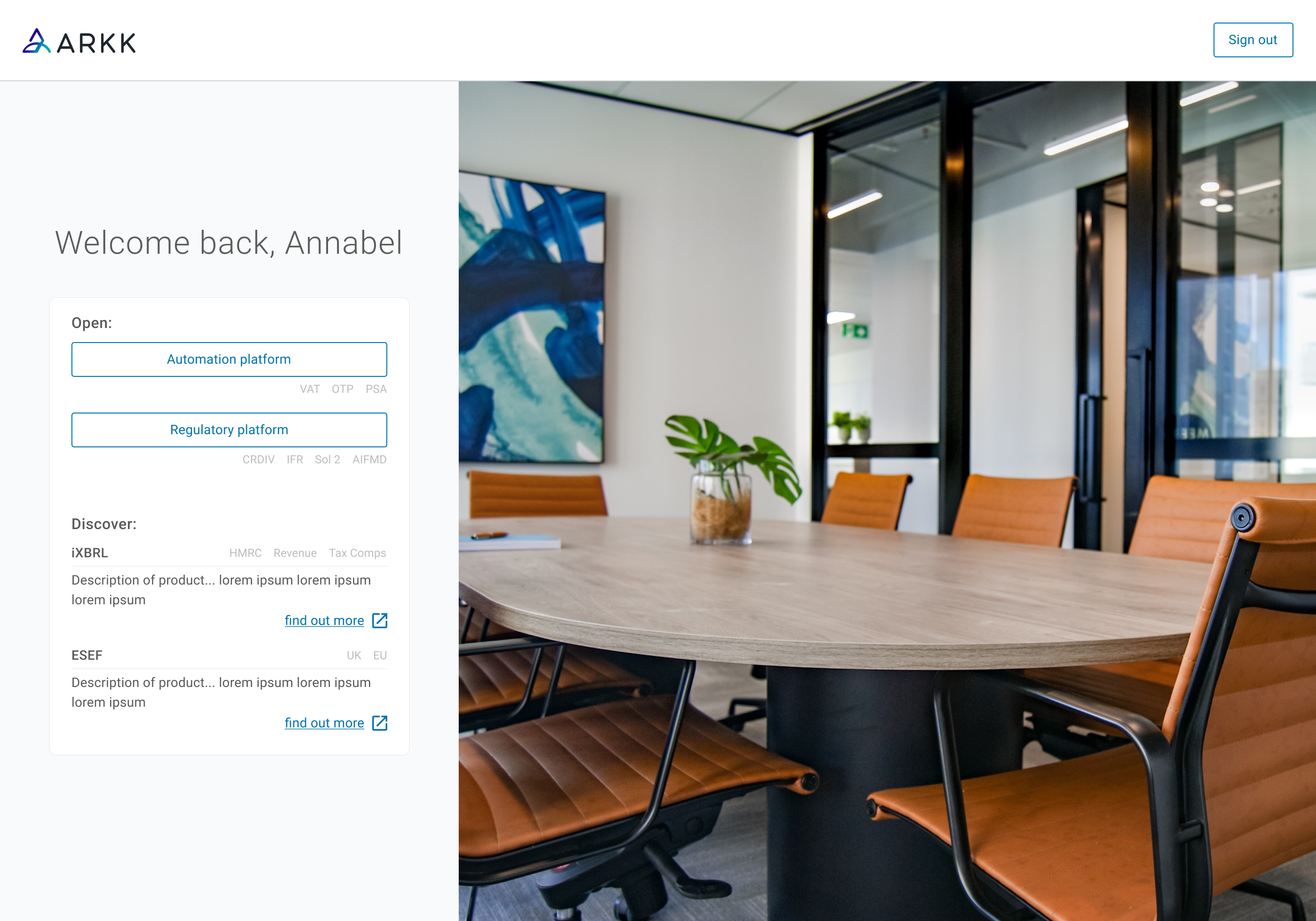
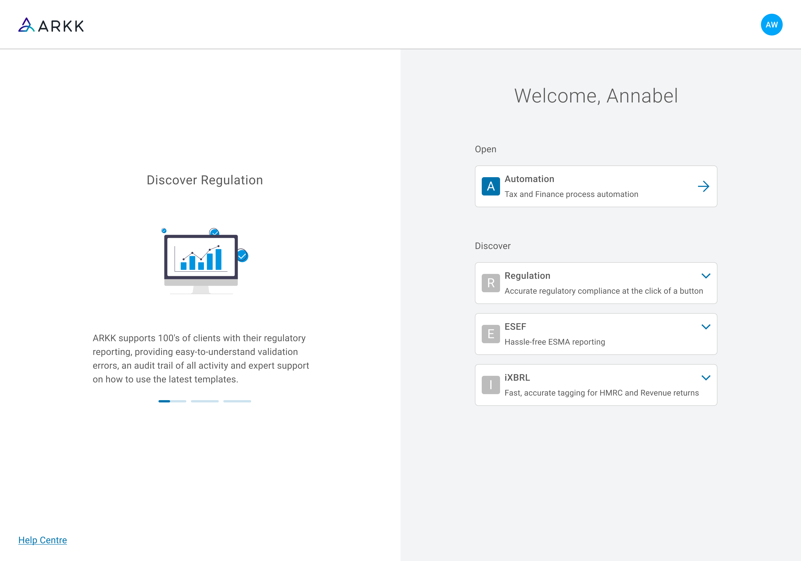
Presenting a new architecture
Products would be grouped into the following sections:
- Open - products within the user’s licence
- Discover - products available, but not currently owned
Hover and selection states allowed users to preview product information before navigating away from the portal, enabling product education without massively interrupting the task they logged on to carry out.
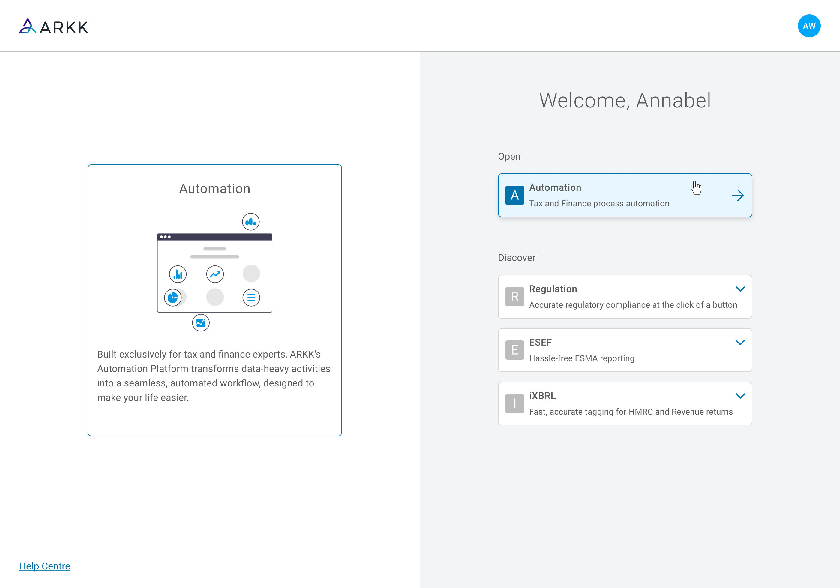
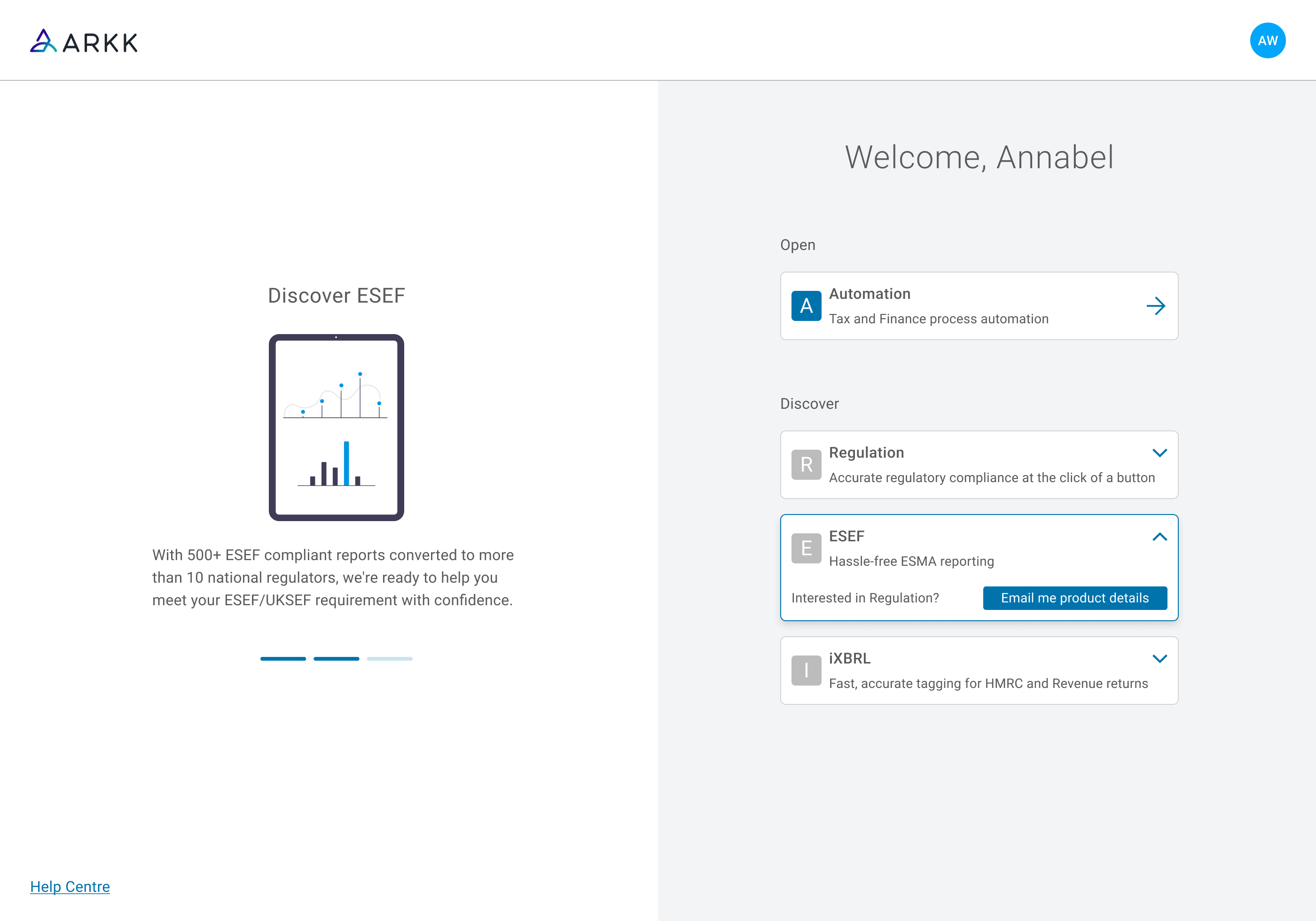 If a customer clicked on a product they didn’t own on the right, this would pause the carousel on that product and expose a button to receive more info.
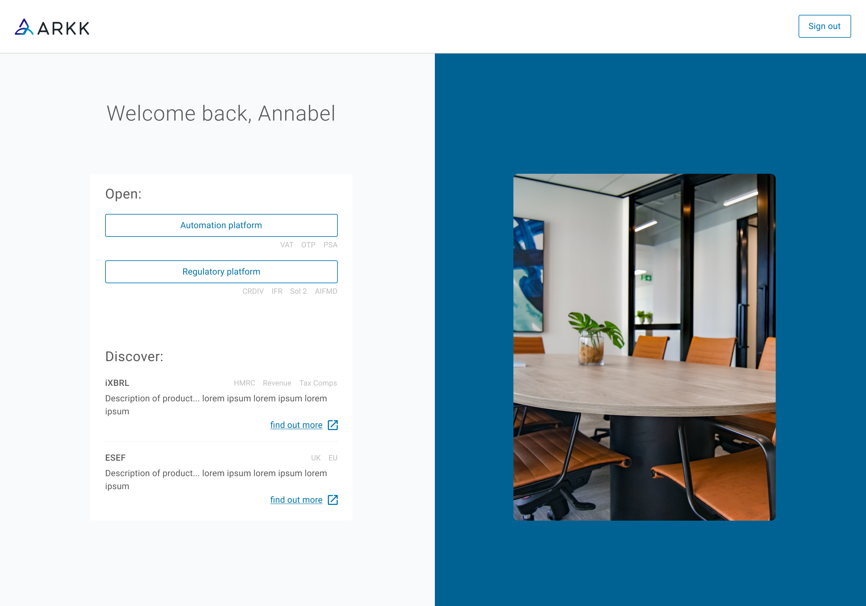
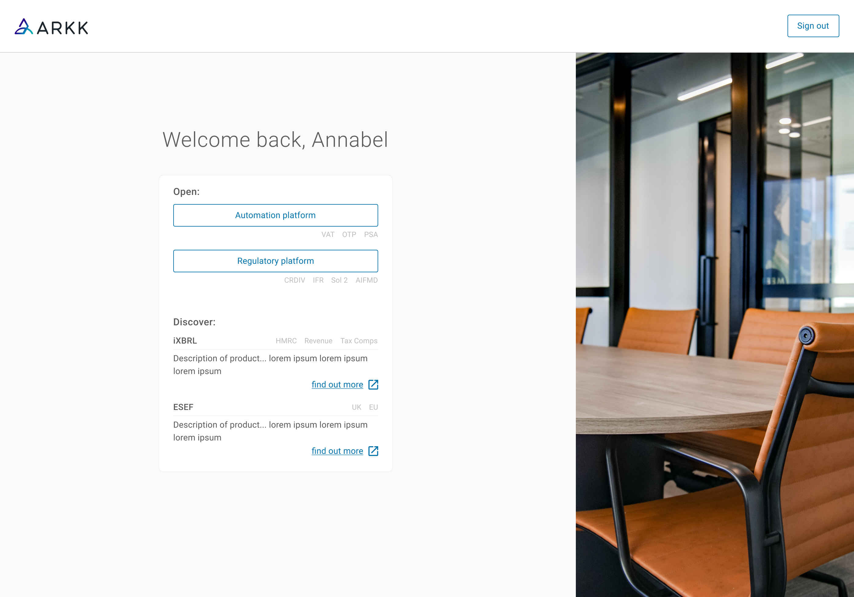
Responsive considerations
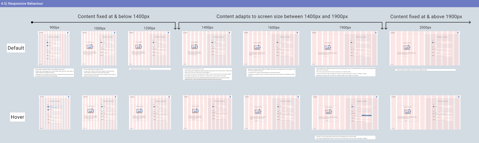 I made sure to lay the expected responsive behaviour out for these screens for the development team. Stating when the contents of the page were to fix at minimum and maximum widths, whilst also changing the layout for screens below 1000px.
Taking ownership & managing cross-team expectations
Assuming ownership of an already in-progress project required rapid evaluation of existing research and decisions, while maintaining delivery timelines across multiple teams. This was difficult initially, but satisfying once that understanding sunk in and I moved forward with decisions that were left to make.
A key focus and personal accomplishment was aligning commercial and usability priorities early in the process. An area for improvement would be improving the visual design of the product tiles to feel less busy.