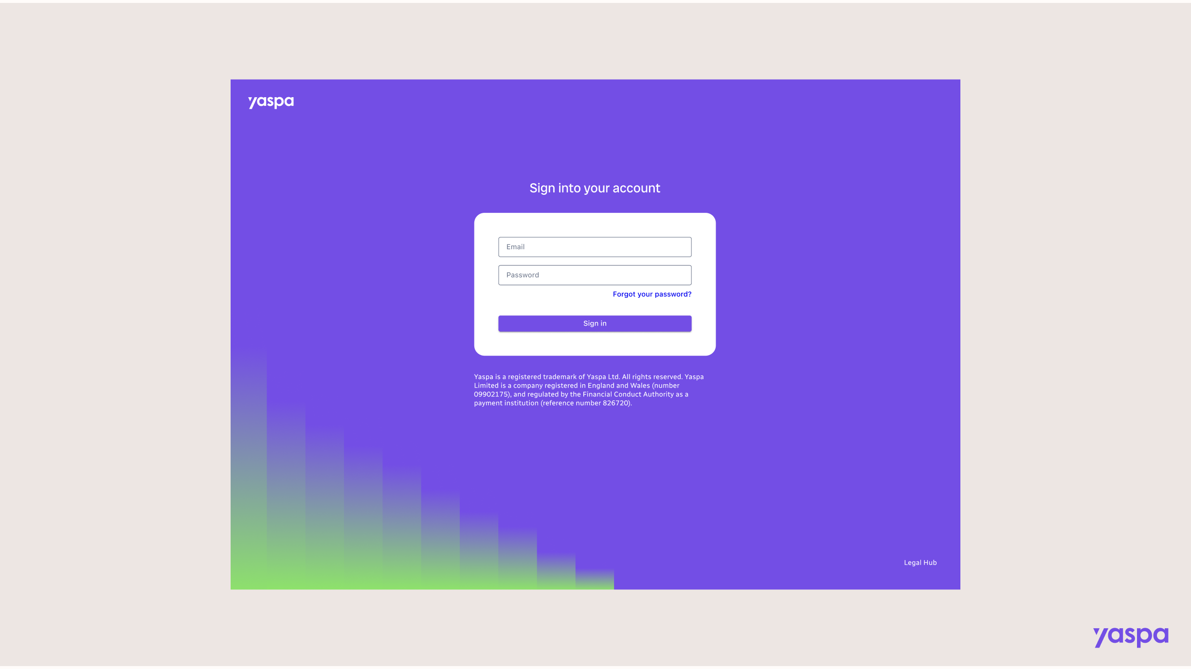
Merchant dashboard
An outdated B2B dashboard with a confusing layout was an under-used asset
The admin dashboard at Yaspa is a crucial B2B communication tool, documenting data on open banking transactions. Originally developer-built area, with only a few UX patterns in mind, it was in much need of a refresh.
Team: Myself leading design, one product manager, one business analyst, one data scientist, three front end developers and two testers.
A fragmented system with buried features and harsh UI
Our initial assessment of the dashboard concluded that it had fallen victim to several quick fixes and add-ons, which consequently hid a lot of features. For instance there was a heavy reliance on multiple levels of tabs within one view.
For the visual design we noted heavy shadows and text that was far too pale to pass accessibility.
Customers ignored most pages
Reviewing customer activity on Mixpanel for the dashboard informed us that most areas of the dashboard were underused, many of which lay completely dormant.
Customers told us they accessed the dashboard simply to check the payments table, they got confused when clicking around so lost motivation to explore. Unfortunately it transpired that they did not have a huge need to use our dashboard. There was an opportunity to improve and educate on the benefit we were able to provide customers.
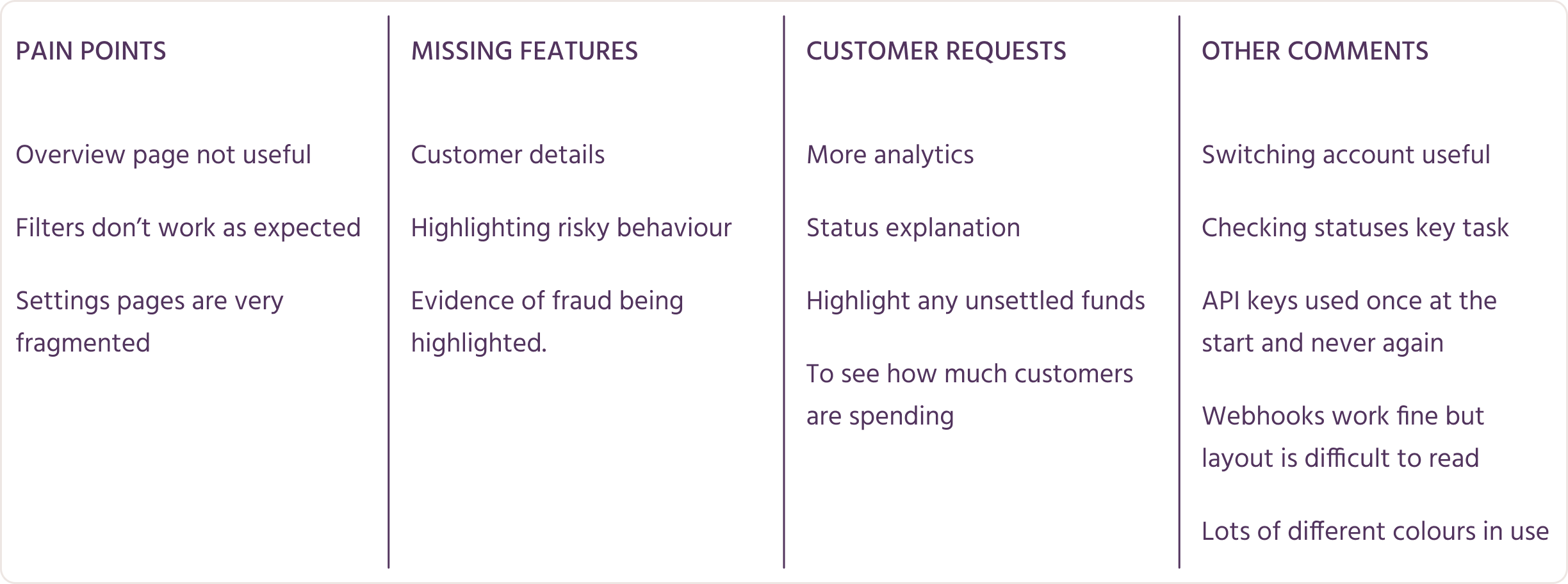
Conversations with internal team members revealed more about what was missing and broken, something the compliance team were incredibly eager to rectify due to regulation in the gambling industry around basic customer identifiers.
An aim for the clarity that other dashboards achieved
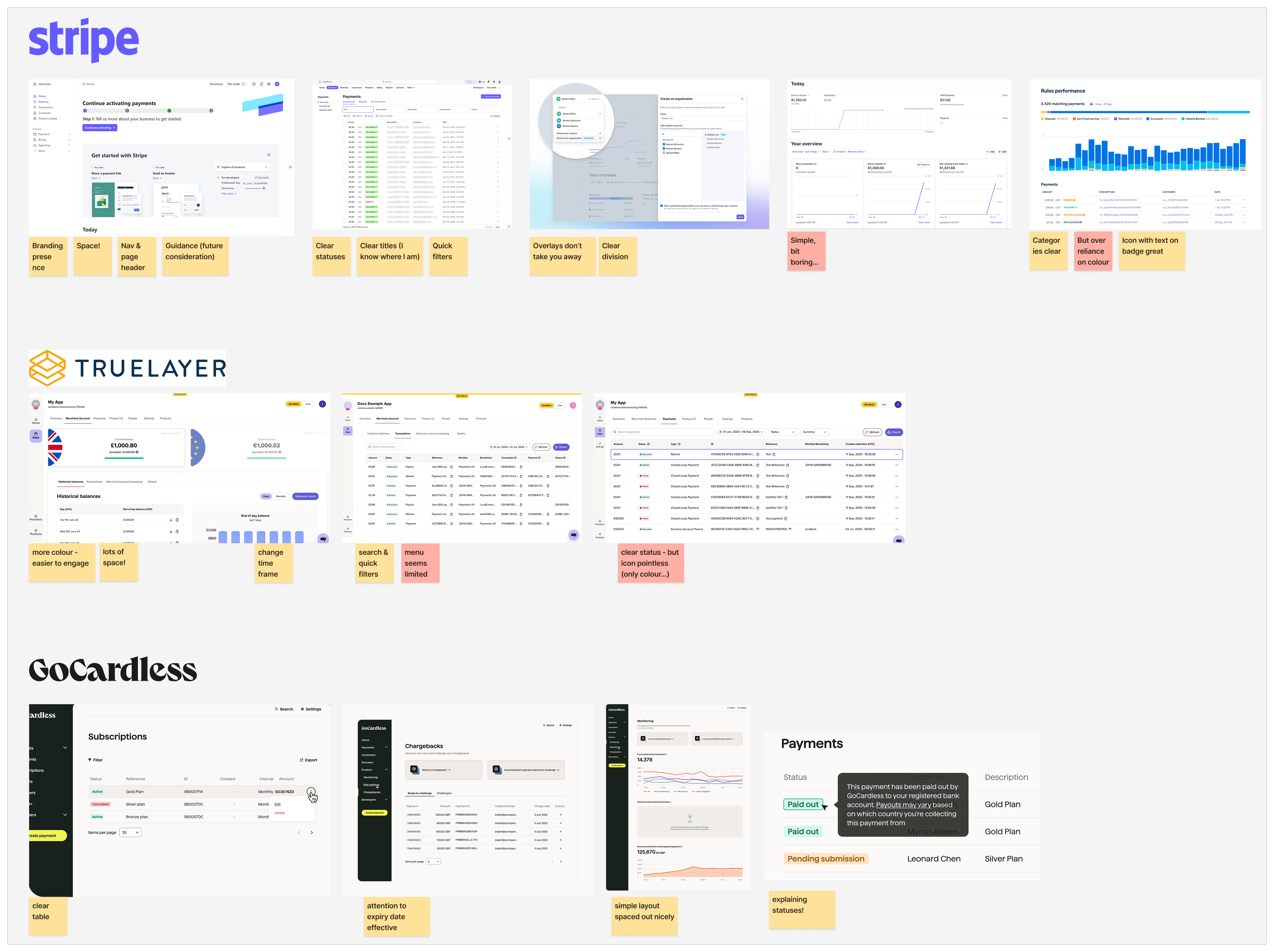
A critique of relevant payment dashboards including Stripe, GoCardless and Truelayer, taught us the need for a calm visual hierarchy. The data-heavy reality of payment information requires key metrics to be scanned, with further details easily accessible when required. Common patterns included drilling down from high level grouped transactions, to individual details close by on overlays or modals.
Mapping areas & setting priorities
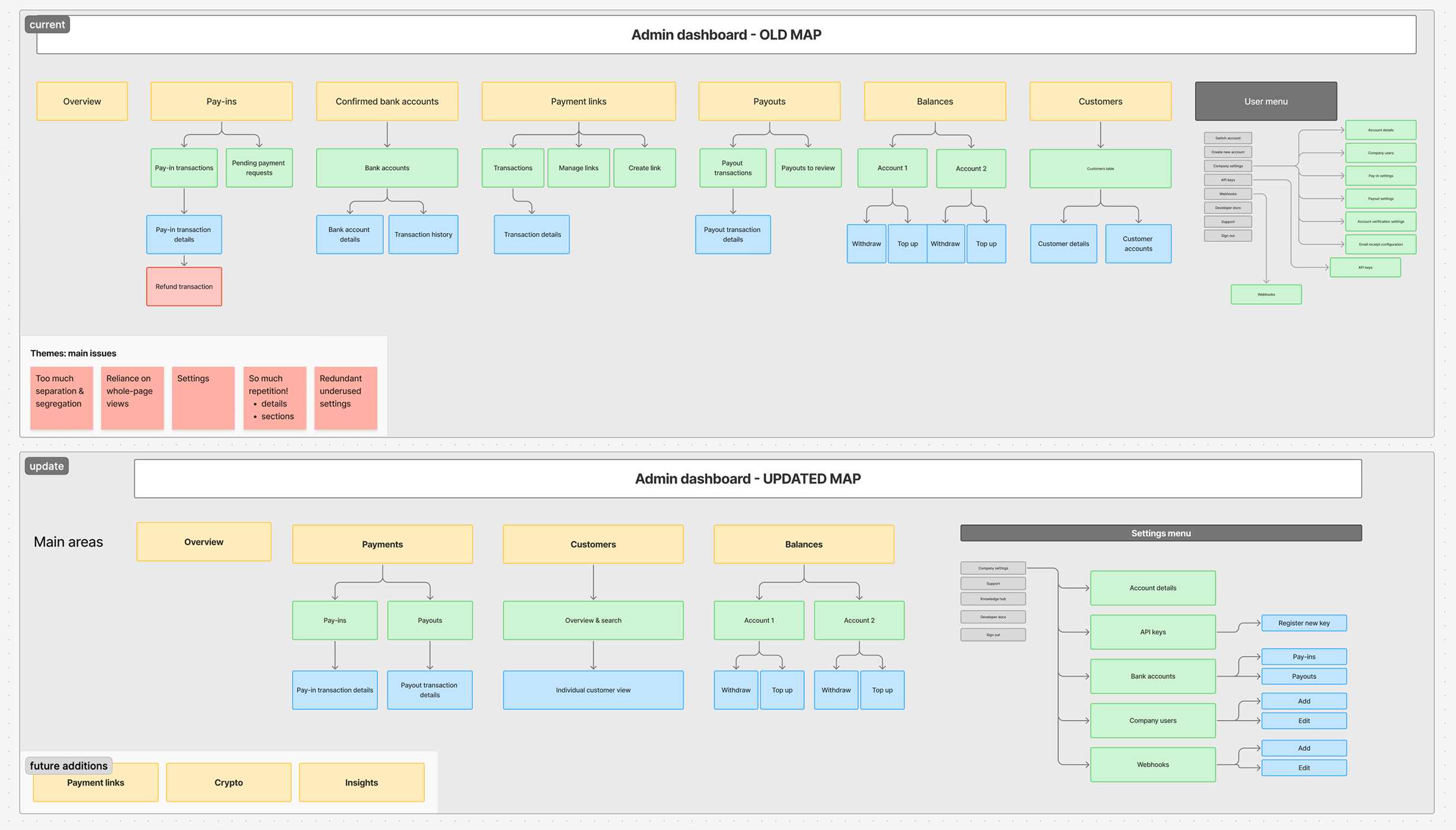
A page-by-page assessment was conducted to determine what to keep, improve or remove. This was an extensive exercise completed with the product manager to refine requirements, and the front end team to manage expectations and technical details before we started designs. A design plan was constructed that aligned with the development plan, allowing us to design and develop in parallel.
Exploring different page structures that support scalability
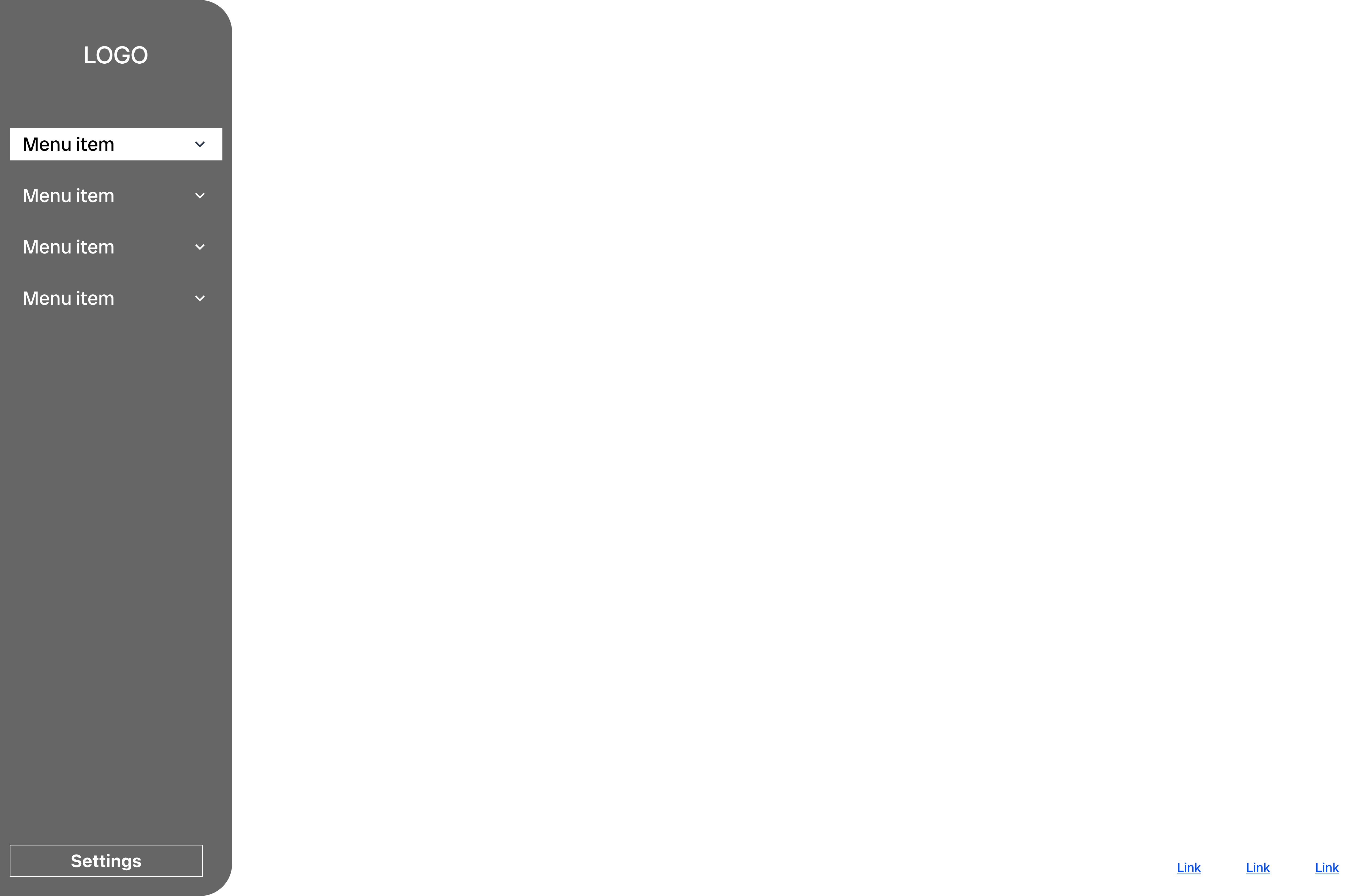
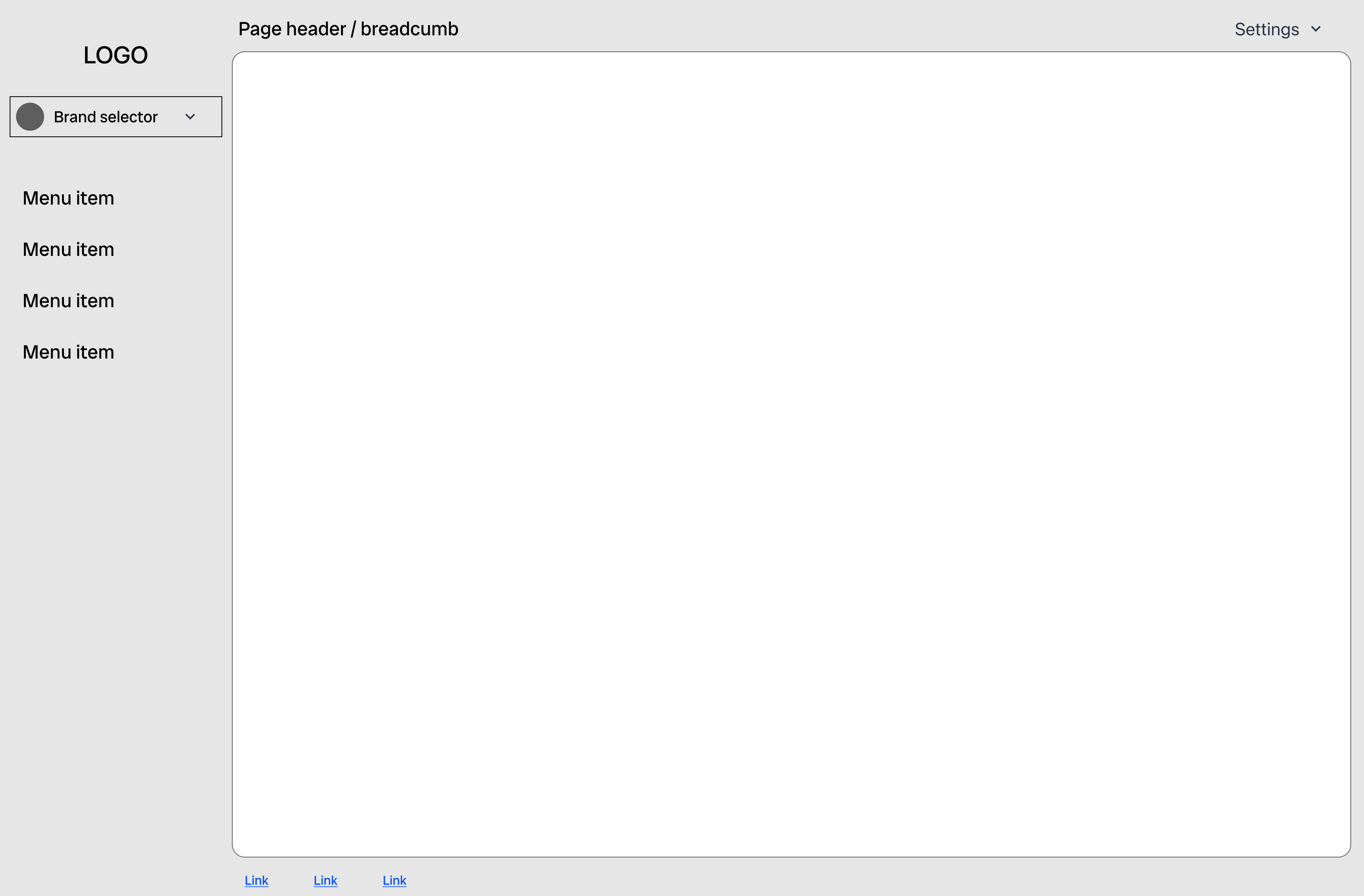
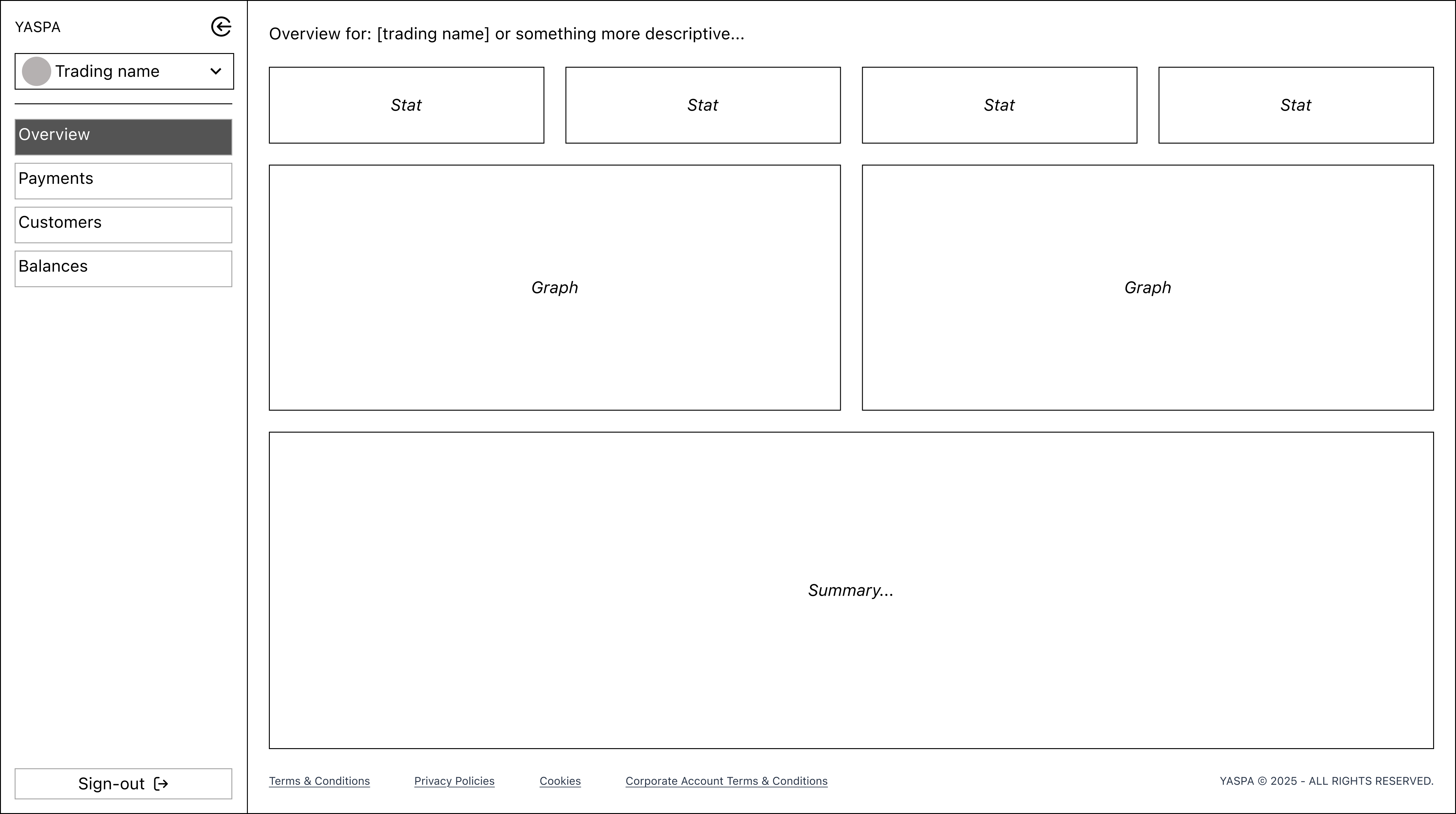
Our research inspired some initial exploration on the fundamental structure of the page and navigation. A left navigation appeared to be the most common and would provide us with more space to add whole pages or sub-sections in the future. It would also allow for an informative page header.
Improving content & structure
After the main structural plan was agreed, we focused on features and functionality. Wireframes were created and reviewed regularly to ensure we were addressing the issues raised by internal and external users. We had wide involvement from the team here, including frequent check-ins with the CTO to ensure transparency and alignment on the project.
Delivering improved layout with transaction transparency
After multiple feedback and refinement sessions with the development and testing teams, we delivered the MVP. Screens were built in stages, giving priority to sign in screens and the payments area.
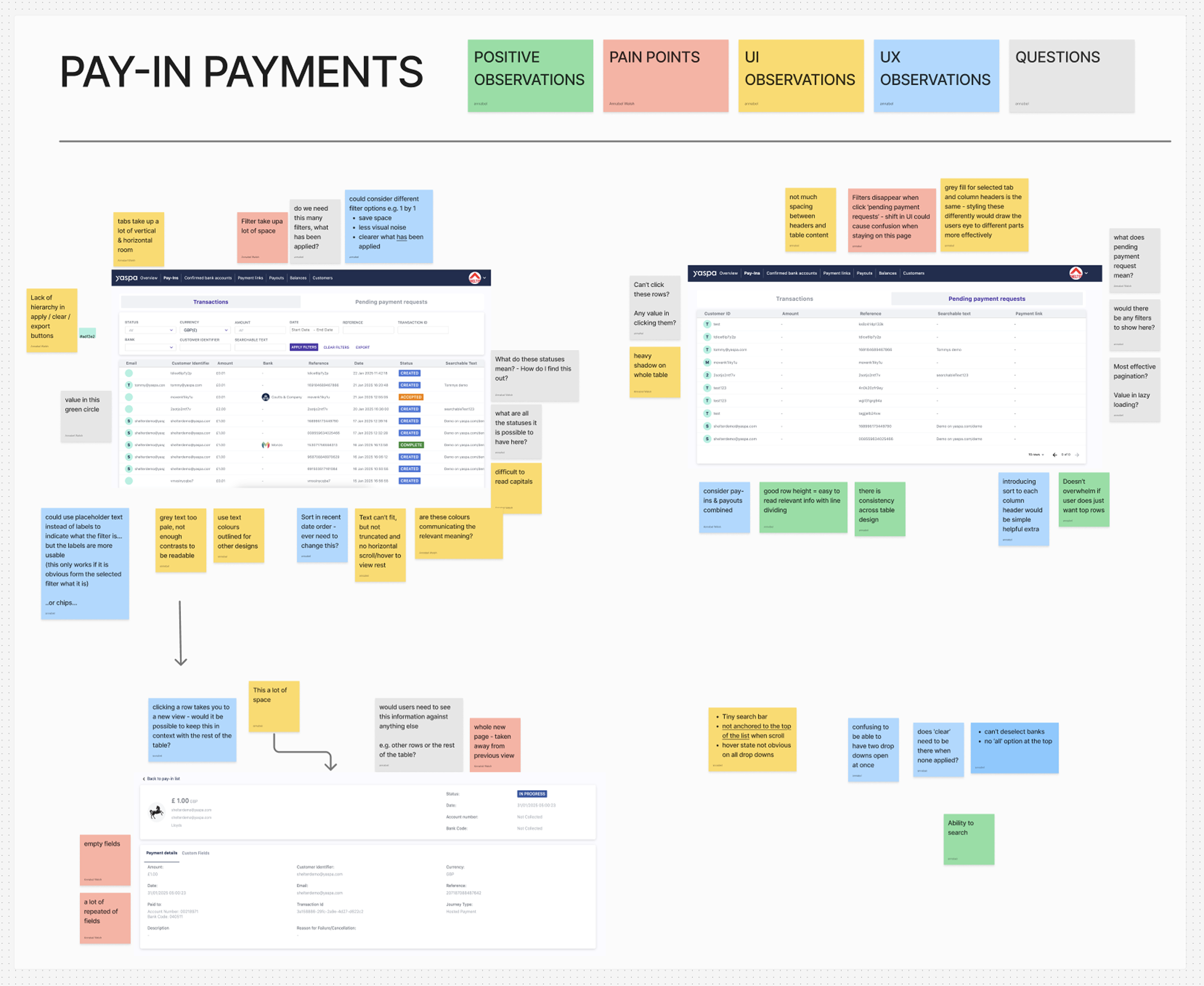
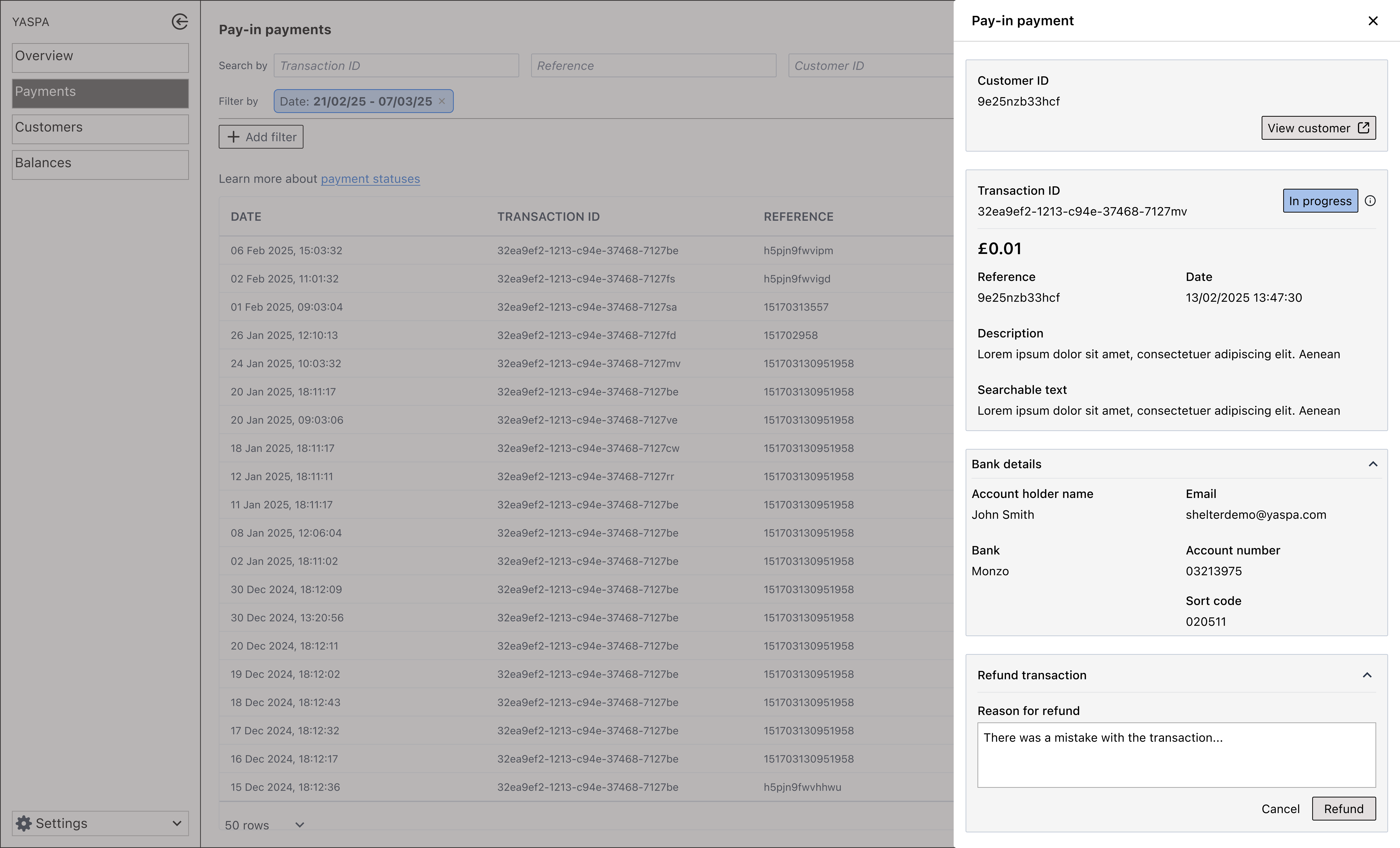
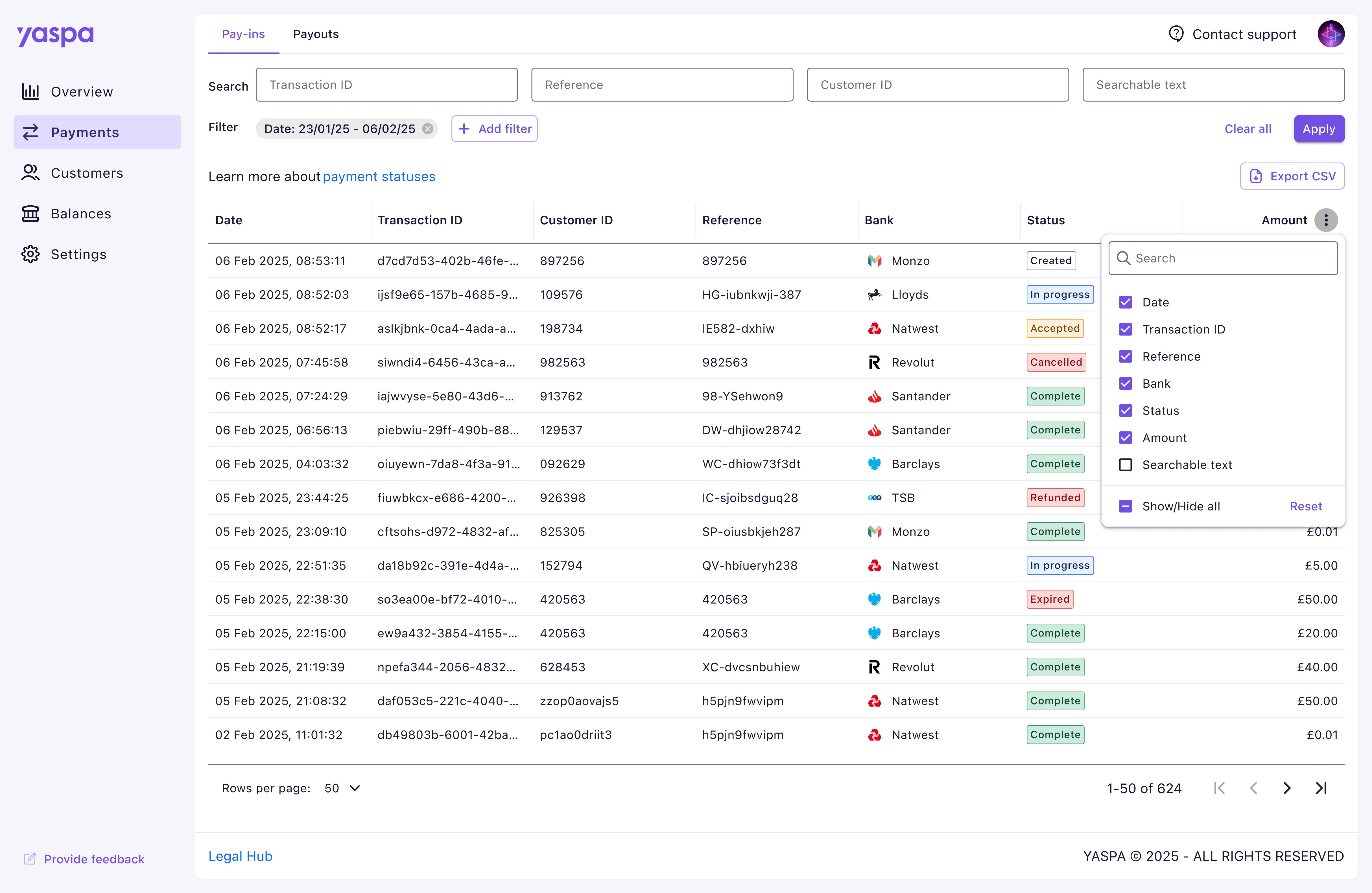 We brought the previously separated payment sections into one page, organised with tabs to save on space and connect two so closely related products.
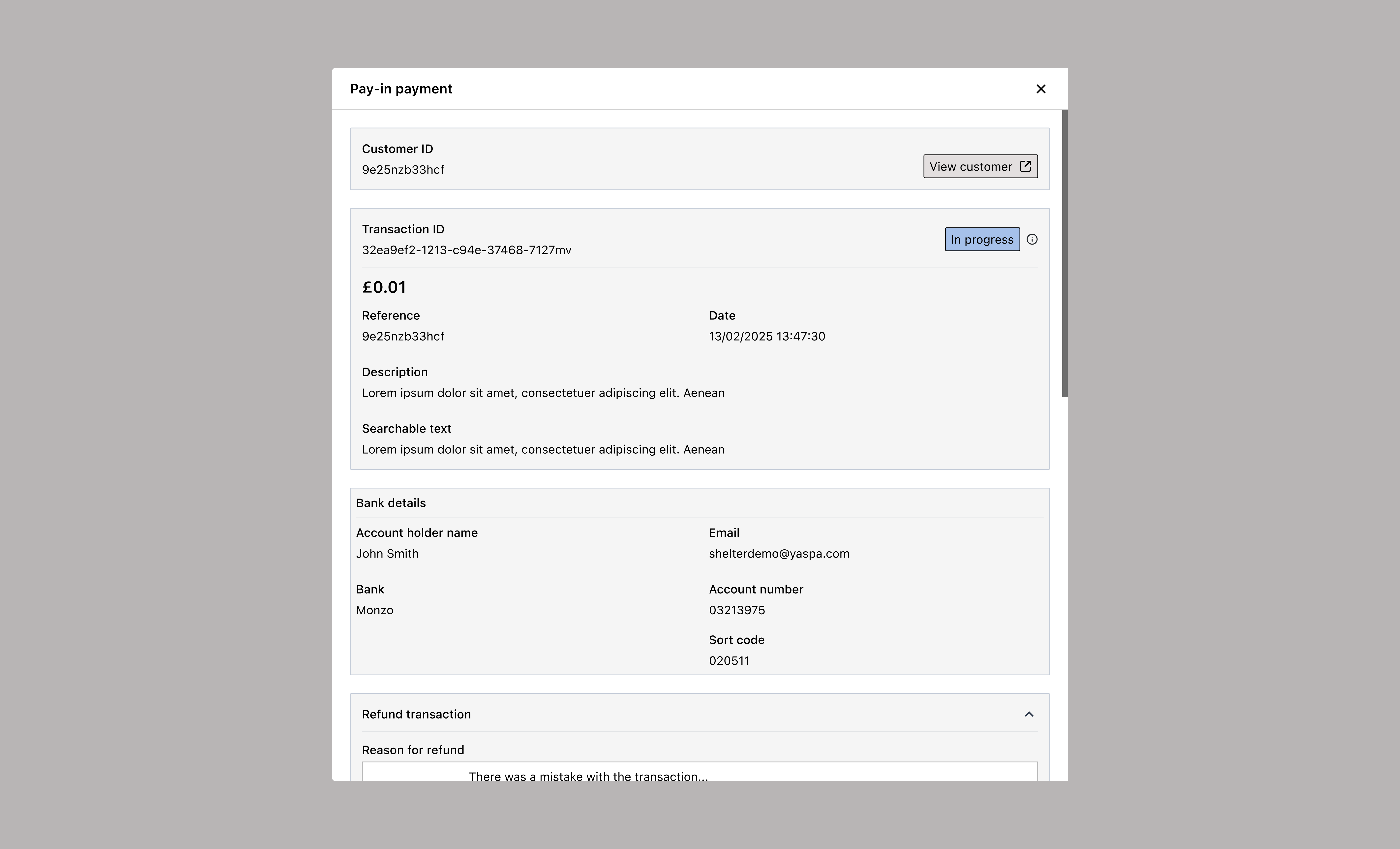
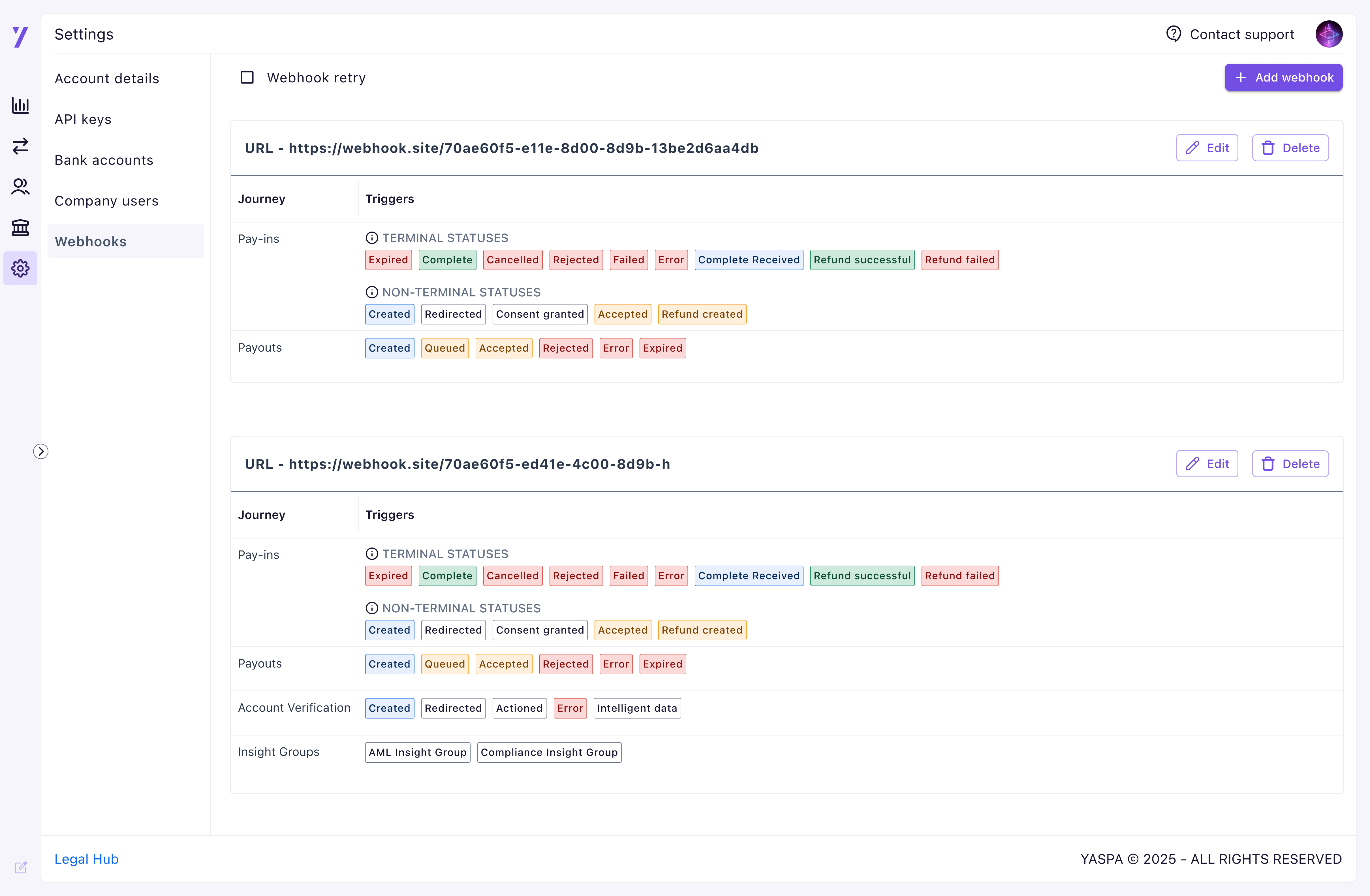
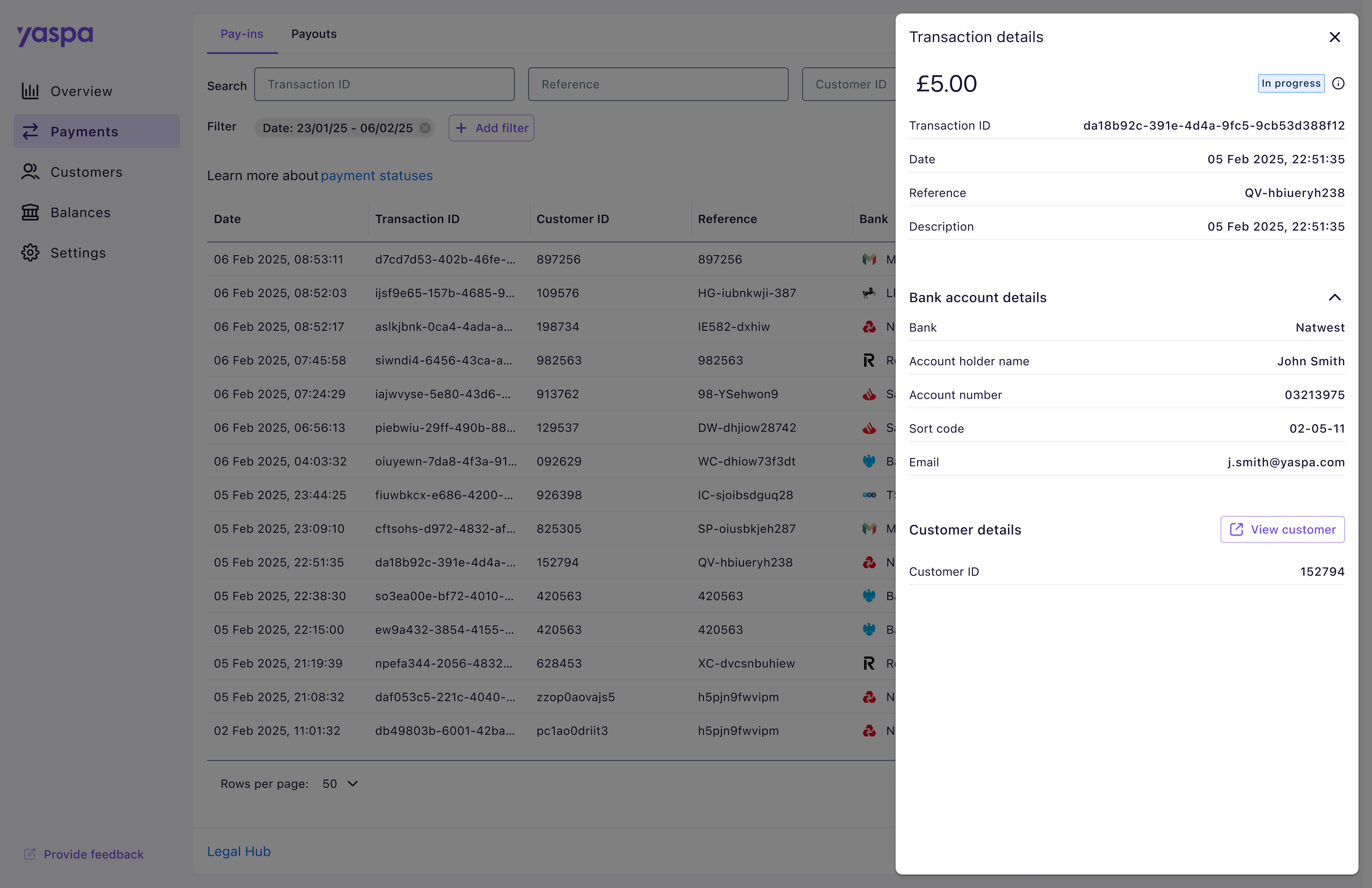 Extra information for each transaction was moved to an overlay, visible on click of a row. We aimed to keep users in closer contact to the payments table, previously being taken out to a whole separate page. This area was designed with scalability in mind using clear collapsable sections, as future functionality would need to be displayed here.
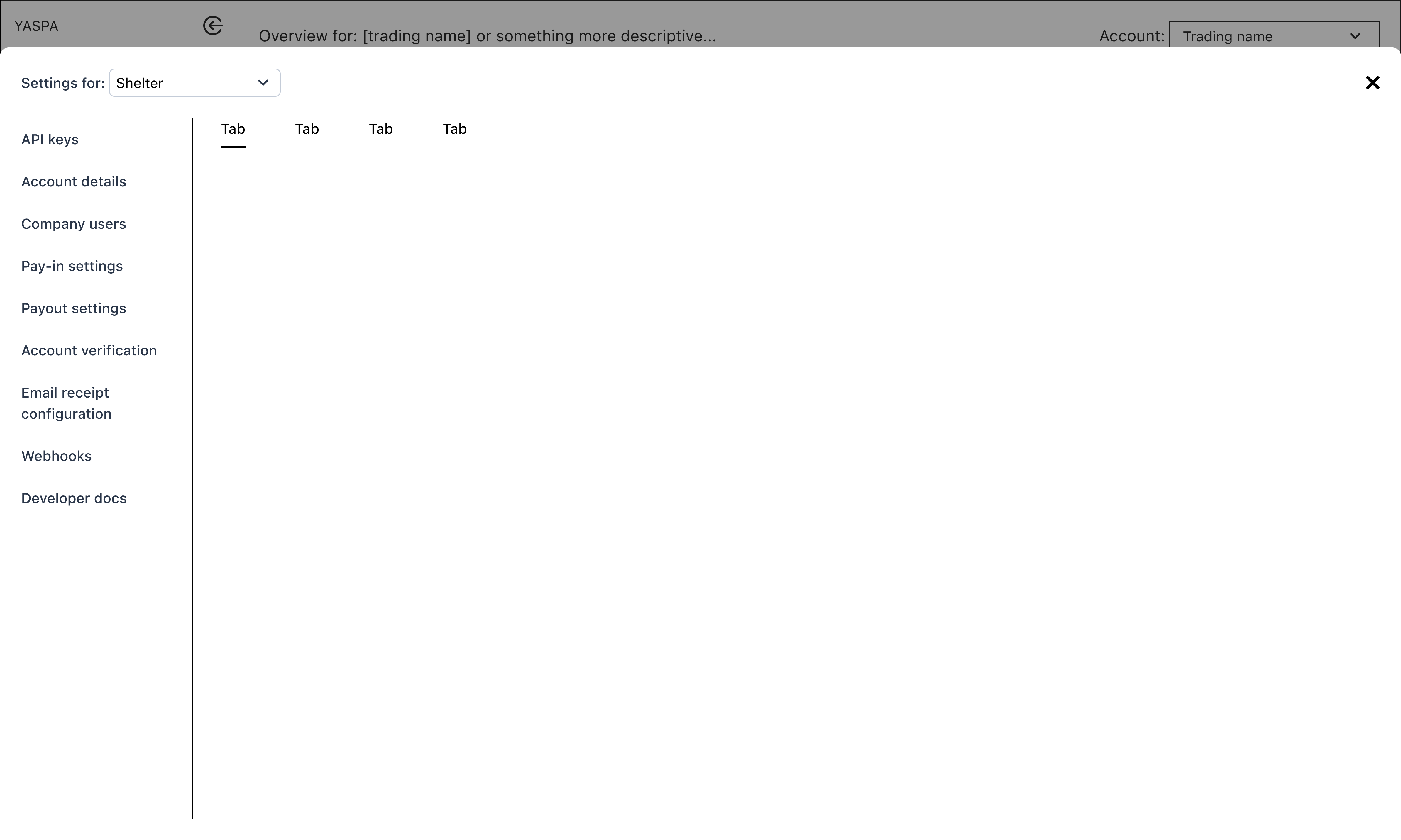
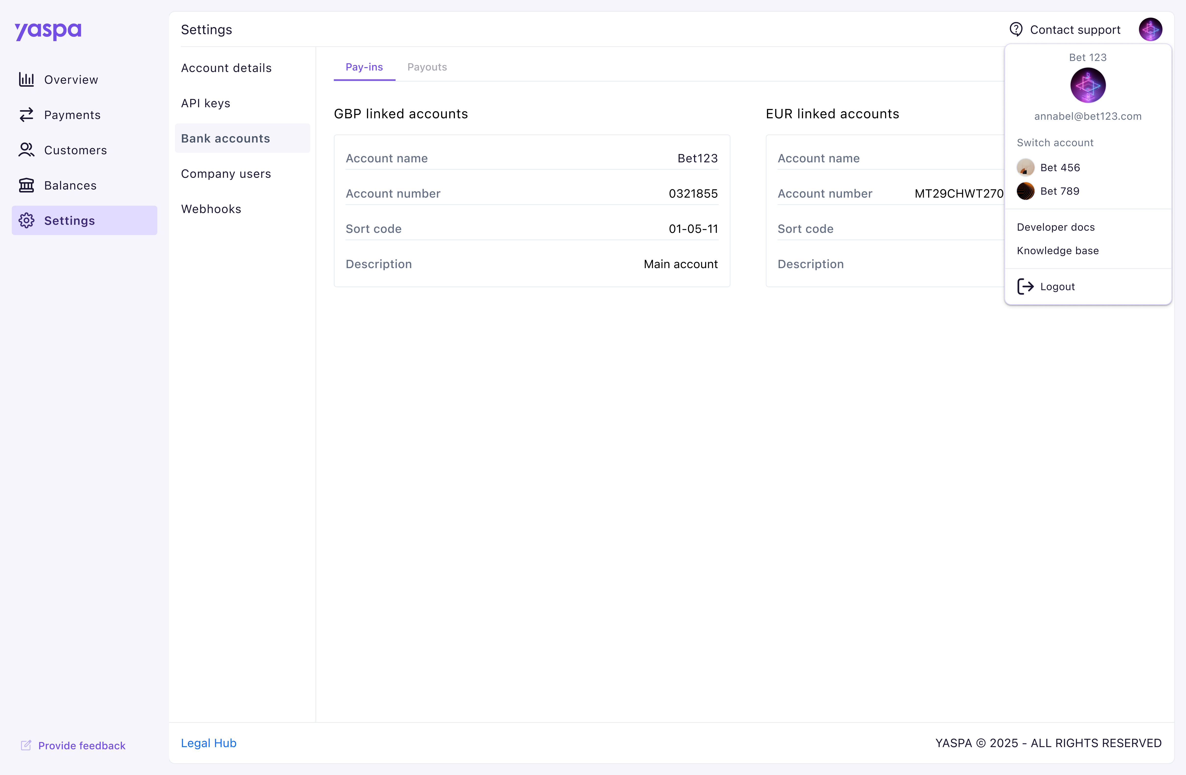 The settings area also received a vertical menu layout, replacing the overflowing horizontal tab design that was filling most of the screen. During research we learnt users often need to contact our support team, particularly in the beginning stages of setting up their dashboard, so we made this feature more prominent in the toolbar. Other less used features, including developer documentation and knowledge base, were kept within the user menu.
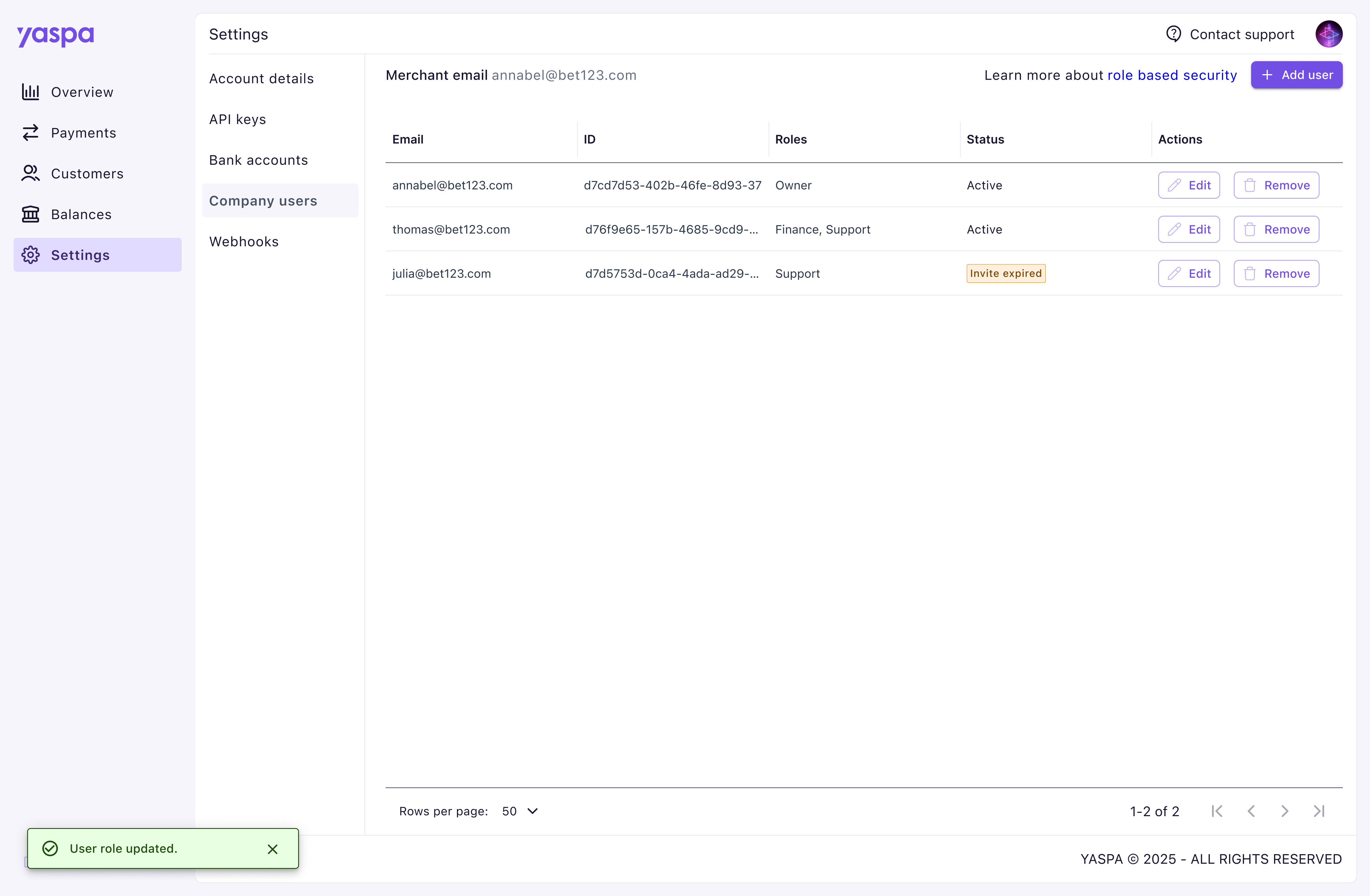 One simple but impactful improvement we brought to the dashboard was feedback. To validate actions and reduce confusion many areas were given validation or error messages to reduce clicks and therefore the multiple expensive calls which were occurring in the absence of these.
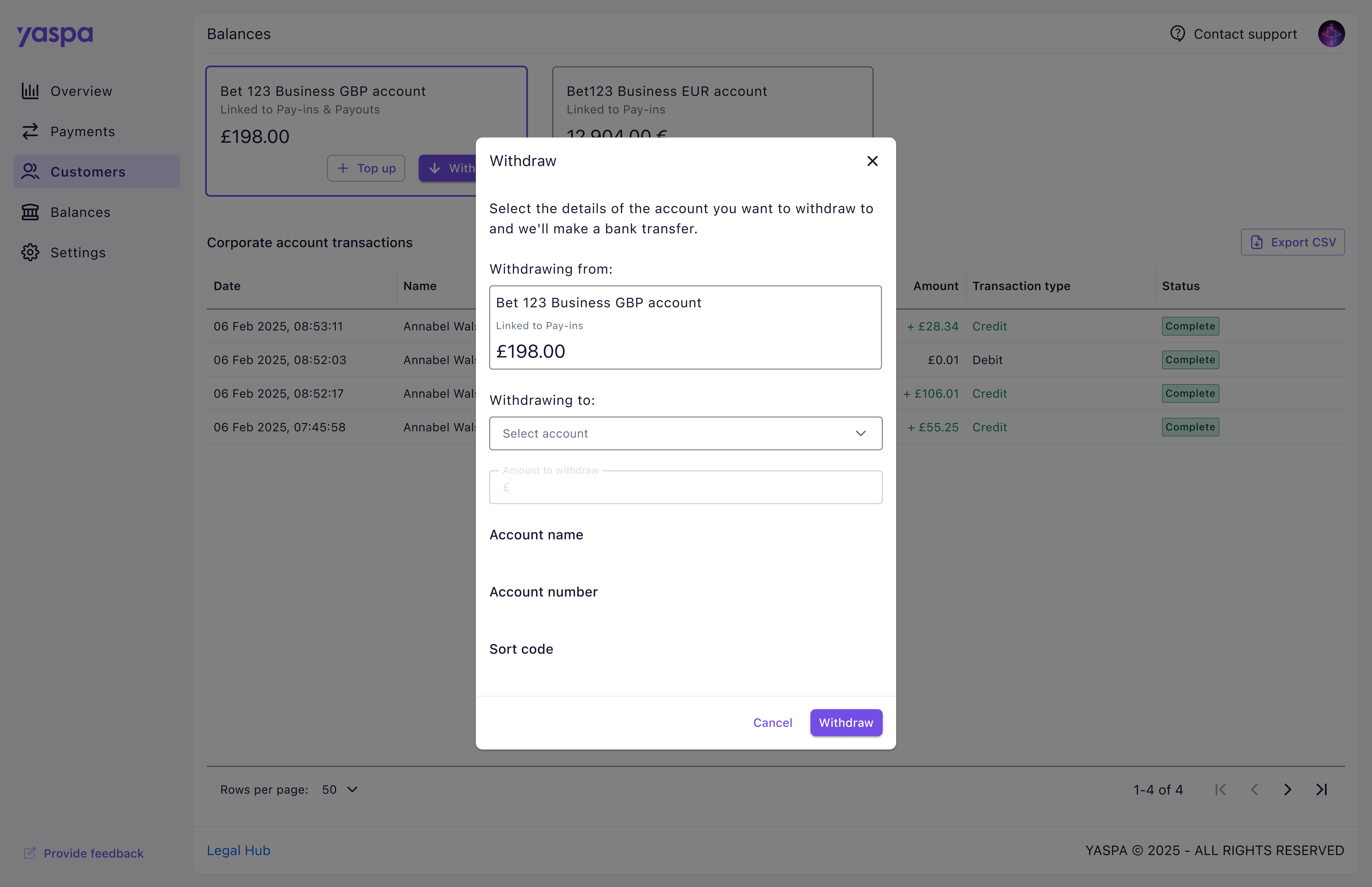
 We included the option to have a collapsed side panel to give users more space to see their information. This has been reported as particularly useful on data heavy pages, including payment tables and the webhook display.
Testing challenges
During this project we carried over a huge amount of functionality, and our focus in testing was therefore primarily to ensure this functionality had been preserved. We did however discover a lack of documentation at this stage that would allow testing to be carried out smoothly. We worked closely with our business analyst to first identify key user scenarios, which we could then check through as a team. This massively improved our process for the future.
Due to a disappointing number of responses from merchants for us to test the new dashboard with, we also added a ‘provide feedback’ button in the main navigation to encourage our customers to give any details as they went about their tasks. This did prove useful, and helped guide a series of updates featured below.
Recognising customer feedback, adding functionality & applying a rebrand
The UI for the MVP was initially kept intentionally minimal in acknowledgment of a company wide brand refresh that was in progress. The following designs feature the updates we applied in collaboration with the marketing team, along with a much anticipated overview page and extra functionality.
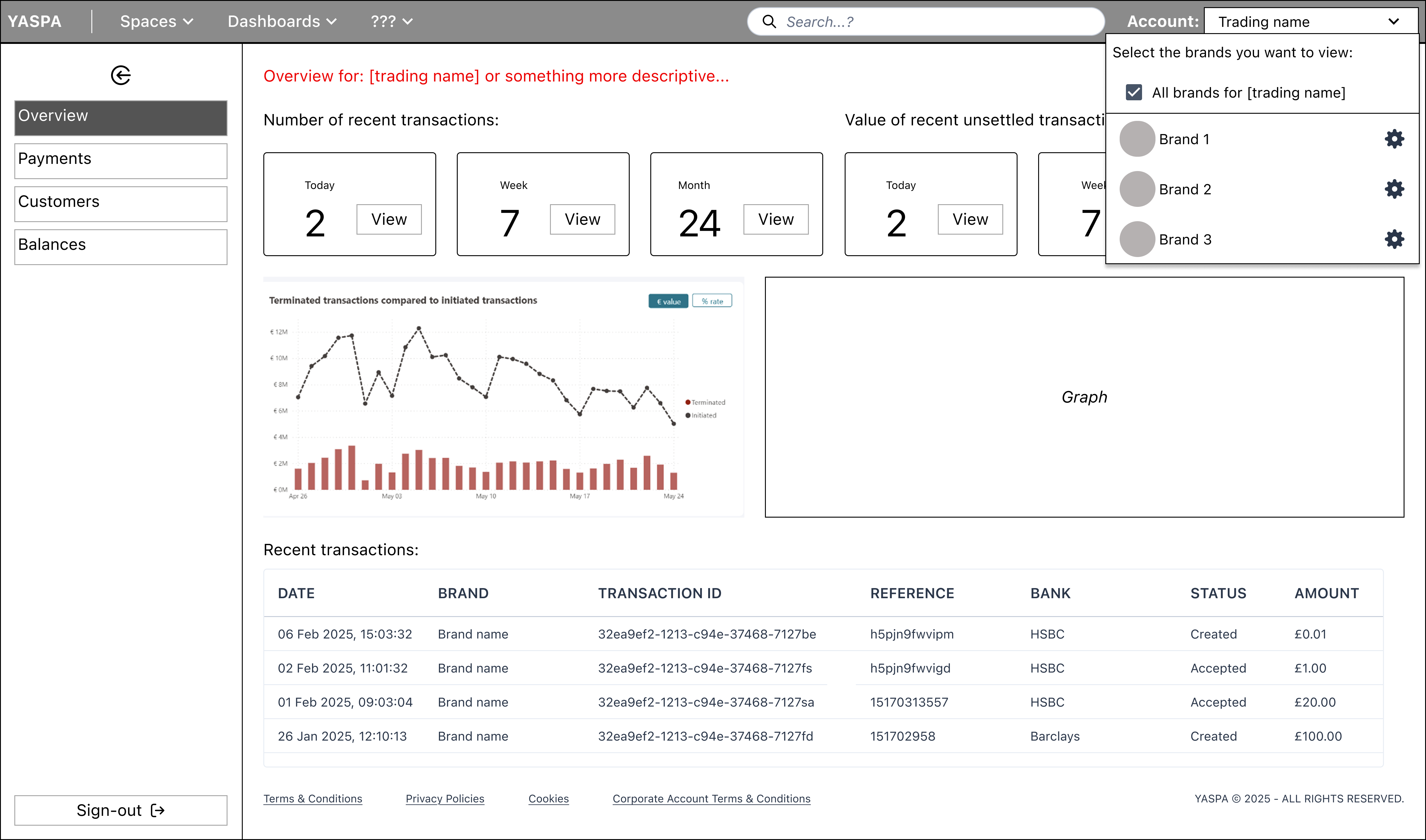
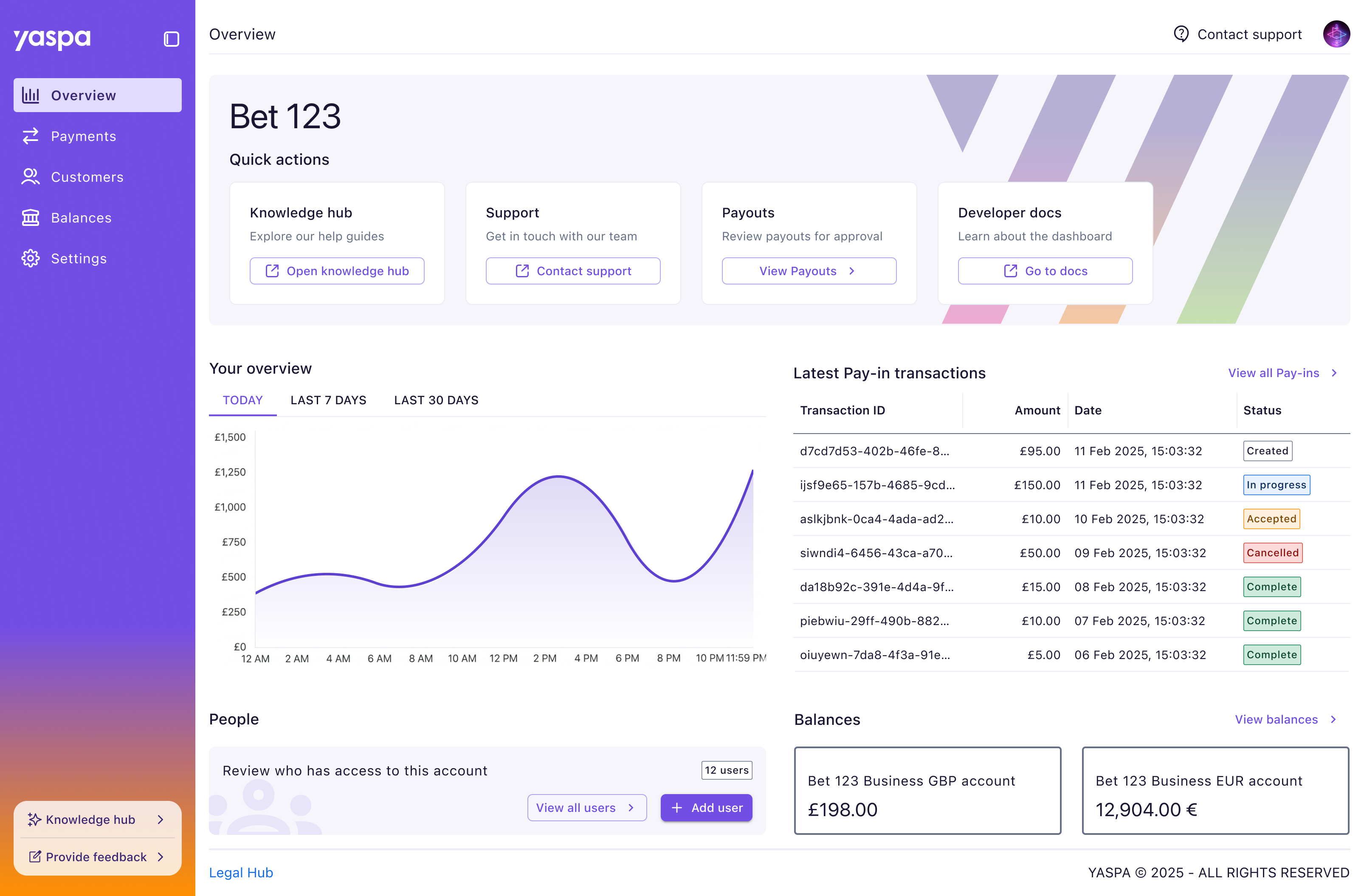 Along with a design upgrade for the navigation panel with our signature gradient, quick access to out knowledge hub was added following customer feedback with new documentation we had available for them.
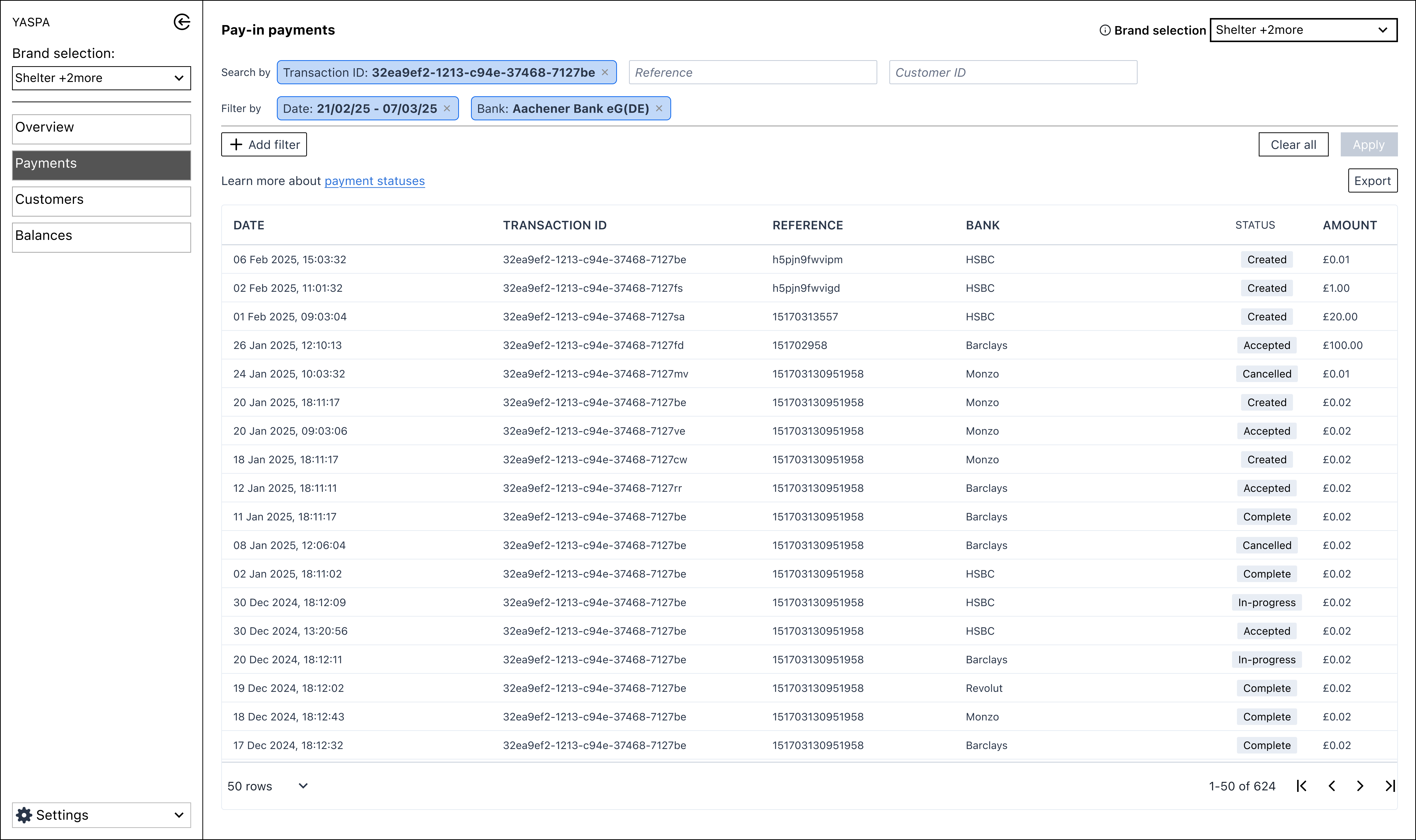
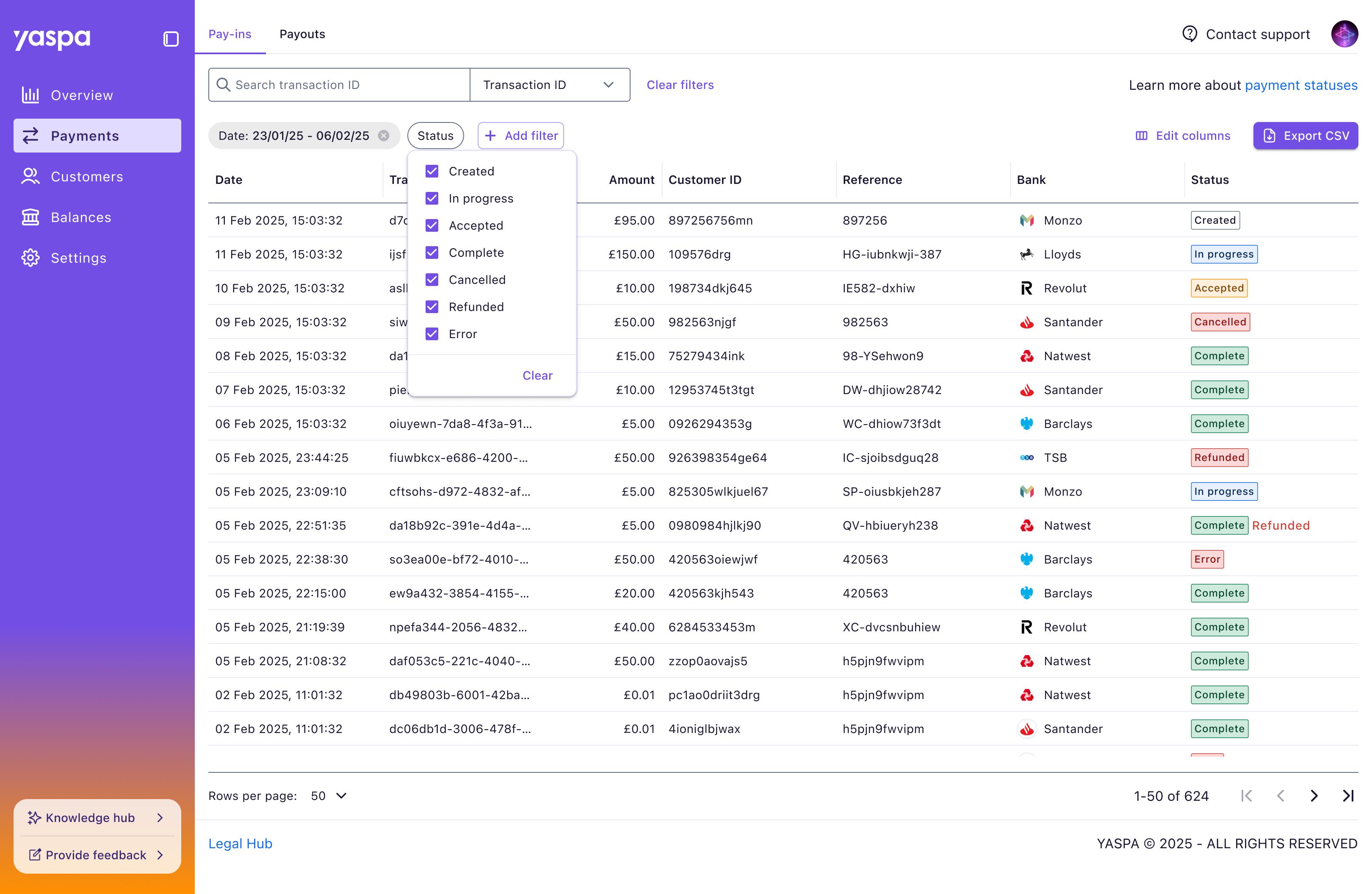 The filters on the payments page were improved with a single search field following customer comments that they only search one column at once, most commonly this being the transaction ID. The need for a apply button was also removed, with filters being applied as they were clicked from customers preferring the instant change.
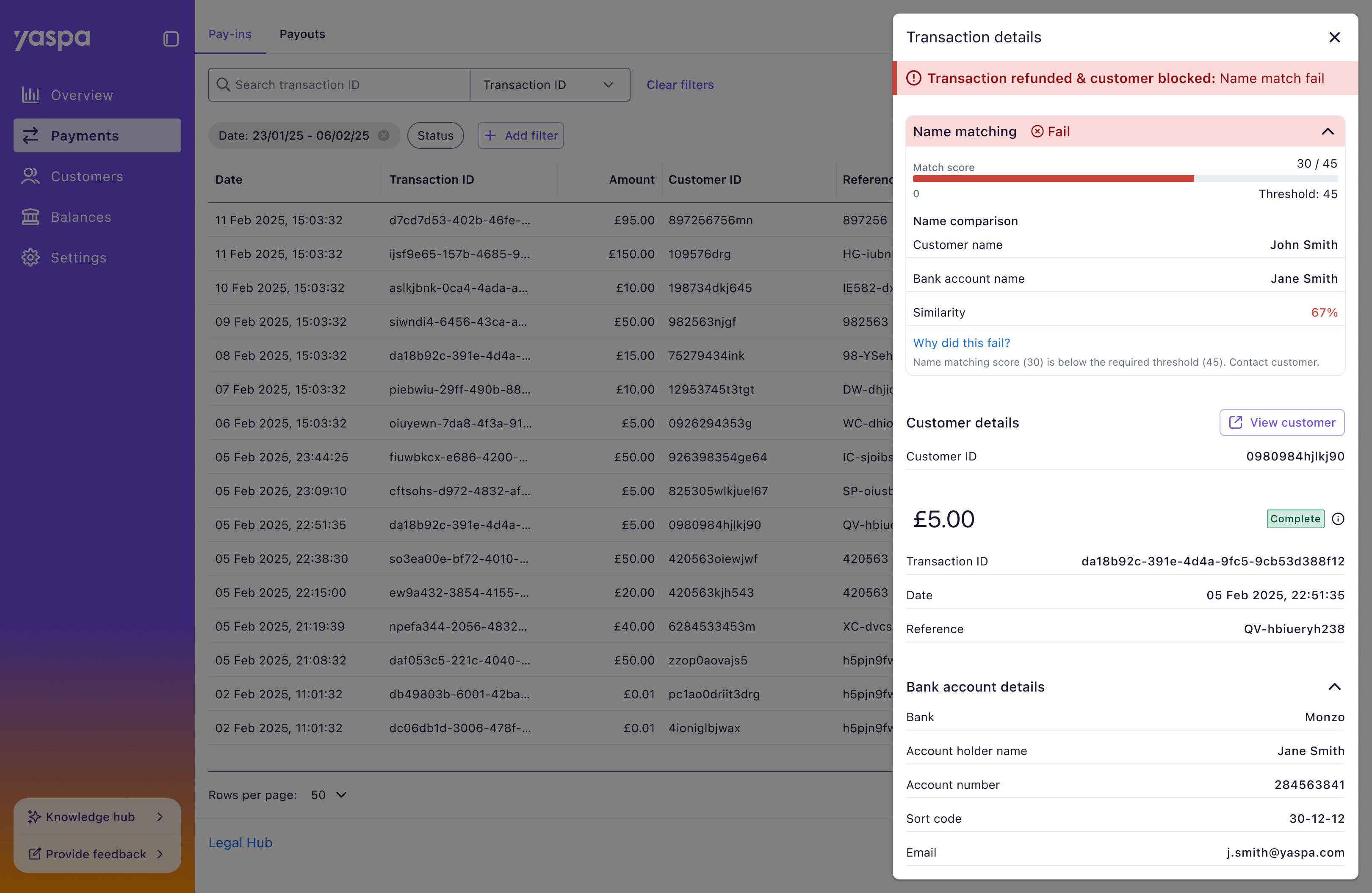 The biggest update to the dashboard was delivered through name matching technology, a huge technical undertaking in open banking, which we added to our product offering. This helps block fraudulent transactions using a score system to review names saved on merchant accounts against the one on the payment method. This was especially welcomed by merchants due to it being such a massive compliance issue and causing them to lose money through benefit cheats.
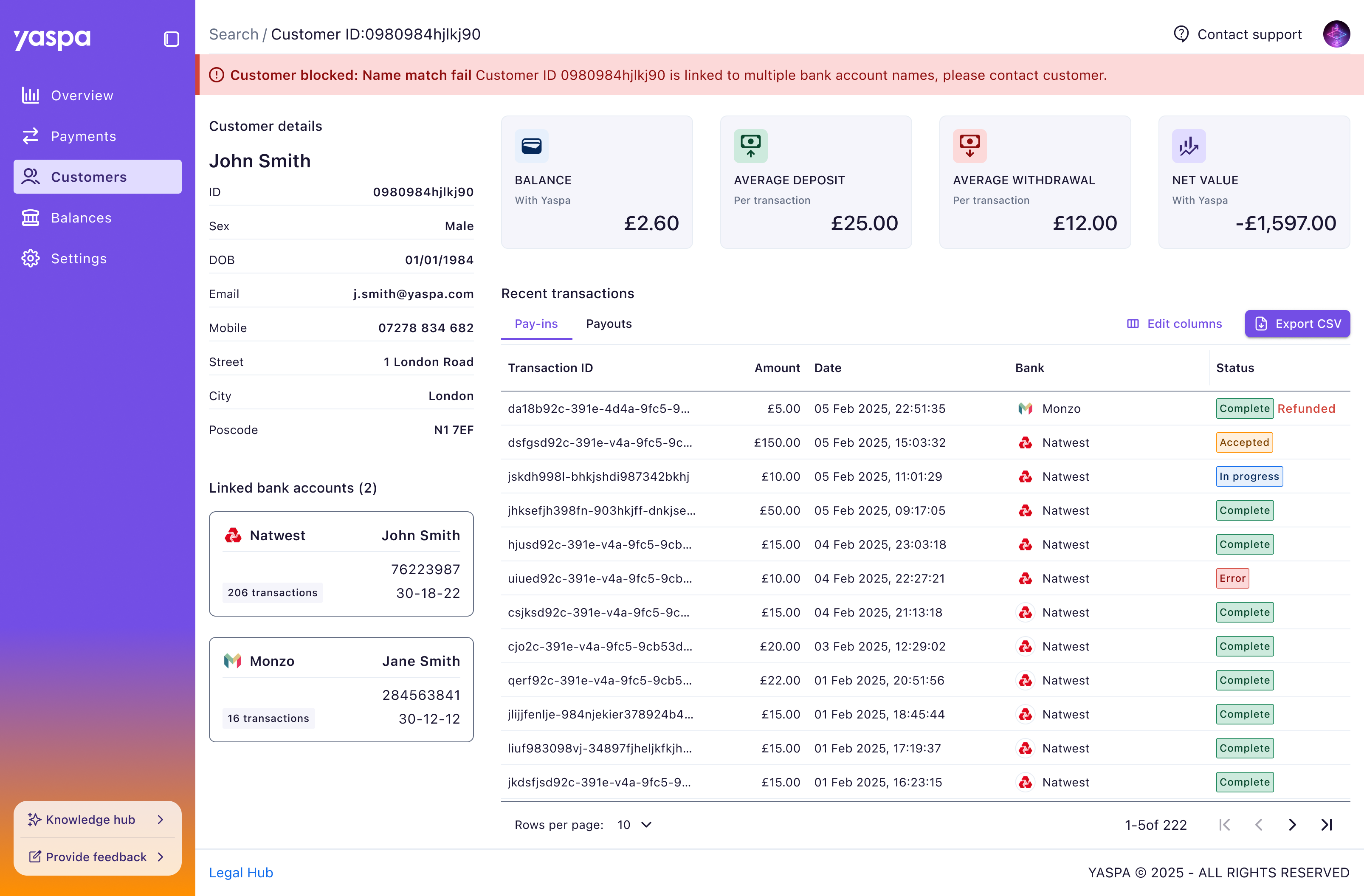 We improved on the basic customers page in the MVP with a detailed customer view. We wanted this to benefit merchants more in line with the new name matching feature we’d deployed. Being able to compare the name on the account against any payment methods was key here, as were customer-specific stats and transactions, which were previously missing.
An evolving dashboard that can be built upon
It was great to work on a different project at a new company, and contribute to improving process in a busy startup. With Yaspa’s product offering growing, even whilst we were designing the dashboard, I was proud of how we rearranged content with a reliable foundation to update areas to accommodate these new features. The acceptance of the dashboard as an evolving platform by the wider team was satisfying motivator to working on it.
Reflecting on the work there are many areas for improvement and fixes to address, including speaking to customers more frequently which would help address this. Our research was heavily reliant on internal colleagues due to customer reluctance to engage.